Simple but still major issues with character select interface

Another example I found:

Again, the selection tiles on the top and bottom might be too restrictive for the size the roaster is at the moment. Only solutions I could think of would be to either make tiles smaller (in order to fit more on screen at once, like in the previous photo), or have two horizontal rows of tiles for each player.
Both also come with their own problems. Having only a single row would take longer to scroll over to find the character you want. While two rows would take up more ‘real estate’ on screen. Consequently resulting in smaller character art on this screen, or displaying less of the overall character model.

1 Like

I recommended that a while ago and almost nobody liked it.

I really like this one. But as stated, there’s plenty of problems with it.

I guess I’m one of the few who like the current one, minus all that fog.
I’m very impressed with the select animation created for the characters introduced in season 3.

I gotta be honest, as much as I really don’t think that form of character select would work with the size of the current roster, I really like that design.

But it’s clear the way the current UI is laid out they laid it all out in rows according to seasons to help make it clear what was purchased when you just got one season or the other.
I really do like the idea of using the hero art instead of the current shadows they have now.

You know what? They could add 3 rows on each side and have them scroll like in classic KI.

I also really think it needs to be restated–SFV is not doing this better. The time it takes to load into character select in that game is substantial, even on PC. I think the mandatory time spent in a loading screen to load in every SFV character model is a much worse case of wasted time than the time it takes for the KI character models to load in that you can still select accessories and colors during. If you know what you want to pick in KI, the load time on the models has absolutely no effect on how long it takes to get into a match, while in SFV you will have to sit through a loading screen no matter what.

2 Likes

Man, I love how sleek that first menu is. It’s simple, muted color palette and stylish use of the logo, coupled with the hero art, as opposed to huge, bulky (for that space), slow loading 3-D models is just perfect.

I know that terms like “the classic KI feel” or “the KI aesthetic” are completely subjective and often innocuous terms, but for me, that menu feels like it belongs in a game with monsters, a sinister mega-corporation and dark deities battling in a dystopian future.

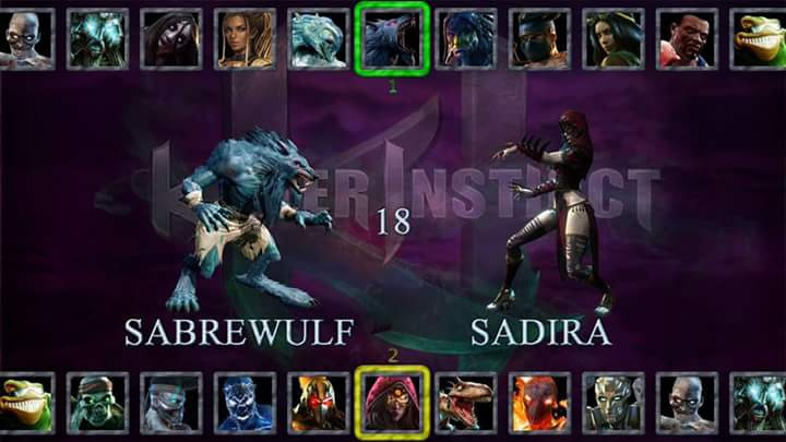
It’s dark, yet somehow still vibrant, and not the least bit depressing. It’s stylish, yet understated. It’s very clean, but not sterile looking, with an overall fluid, consistent look. There’s no bright neon green fog, purple triangles leading up to a large purple blob, baby blue neon XP up icons all over the place, a huge profile box in the upper left (couldn’t we just bring that up manually with LB or something if we wanted to see it?) or hexagons that don’t make good use of the space they take up while occupying the bottom third of the real estate on the screen.

The current option is a huge step up over season one and two, but I do hope they’ll keep tweaking it and trying to make it even better.


The only way I could see the top and bottom single rows of character thumbnails working is if pressing down or up caused an animation whereby the current row / group of characters (the season one group for example), rotated away from the foreground, down and out of view while the next group (the season two group) came up and in to view; like how a rotisserie oven works with the Cornish hens.

That way, you’re not scrolling to the right 14 times to find a character, but to get from Jago to Cinder, it’s down once and over six times. They could also default the cursor to the middle, and cut down cursor moves even further.

So you still get a scroll bar, which could be clearly dileneated and marked by season, but you don’t have to scroll a ton and you also don’t lose the on screen real estate.

I think at this point, it’s not just a matter of nostalgia. If they have a 4th season, that’s another row on the select screen. Now, they can always compensate by making the character thumbnail icons smaller, perhaps rectangular instead of hexagonal, but even still, if you’re separating them by season, you’re still going to have four rows and there’s virtually no way to do that without sacrificing a ton of real estate on the select screen.

To be clear, as I said, this isn’t a nostalgia issue or even a vanity issue, it’s a potential ease of use issue. Players have to select not just characters, but current/retro, accessory loadout and color. This menu will start to look very cluttered if the current amount of real eats rate on the screen shrinks. Sure, they can try to make everything smaller, but I don’t know if making stuff harder to see is all that great of a solution either.

1 Like

The problem I have with the character select screen is that Hisako is facing the wrong way.

1 Like

Never thought of that. Good point, Dan.

Hi, btw. Max fan here.

Colors that are bonuses for specific products shouldn’t be numbered like ones that can be unlocked in game.

Maybe: “Definitive1-2” “Special” “Limited Edition” etc


1 Like

Again, this is just making excuses for a simple issue that shouldn’t even be there to begin with. If they’re unable to load character models in a quick fashion, then they CAN at the very least put 2D character renders/artwork in their place and then ONLY load the actual character models (and accessories) once the character is truly selected. This way they circumvent the issues I’ve described while still allowing for people to choose colors/custom accessories as well.

It’s a major UI problem that’s easily fixed, which makes it all the more annoying to me that it’s in there in the first place.

You just have a OCD problem josh. Might need to loosen up the shoulders a bit.

See this is why no one ever makes headway in this forum and why huge mistakes like this keep slipping through the cracks, because people like you constantly dismiss these observations as being from someone with “OCD”.

OCD is the best thing you can have when you’re making a game, it means you pay attention to crucial details which is key in making really good products. Tell me, do all the other UI artists on every other fighting game ever have OCD as well? Because this isn’t something they screwed up on. They had this in their games.

Well, it’s a double edged sword. But hey, not everyone has a problem with it. Just like how not everyone had a problem with SFV’s music. It’s nitpicking, which to an extent is understanbdale
but it’s also a preference thing.

So what do you call the people that don’t have a problem with it.

I can tell you what I DON’T call them. Successful game developers.

Uh huh


If you want to argue for fixing this stuff then fine but at least stop exaggerating it’s importance. The fact that no one has complained about this in the last several months should show how non-issue it is.

3 Likes

No, people haven’t complained about it, not because it’s a non-isue because it is PERCIEVED as a non-issue. But it is still an issue. No one called it out because they know they’ll just be met with derision and dismissal by the obstinate fanboys who think problems like this are not worth attention and that they are somehow unable to fix small but significant problems because “they don’t have time”. KI is currently wracked with problems that won’t go away until someone points them out.