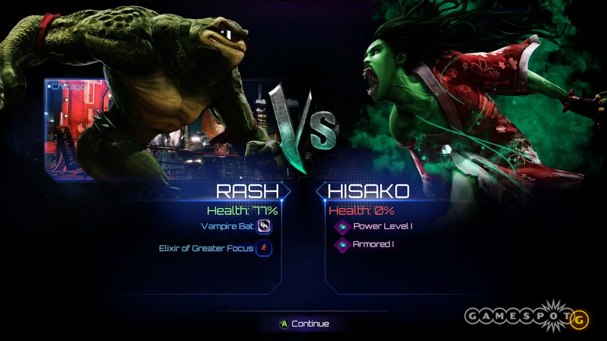
This looks amazing! This should be the new versus screen, I imagine every character has some great artwork. This also helps with the character height like TJ Combo, the characters blinking and the plain awkwardness.
It’s already in the game, but adding it to the main game instead of SL would be a great first step in making this some great eye candy. Which this game needs at this point.
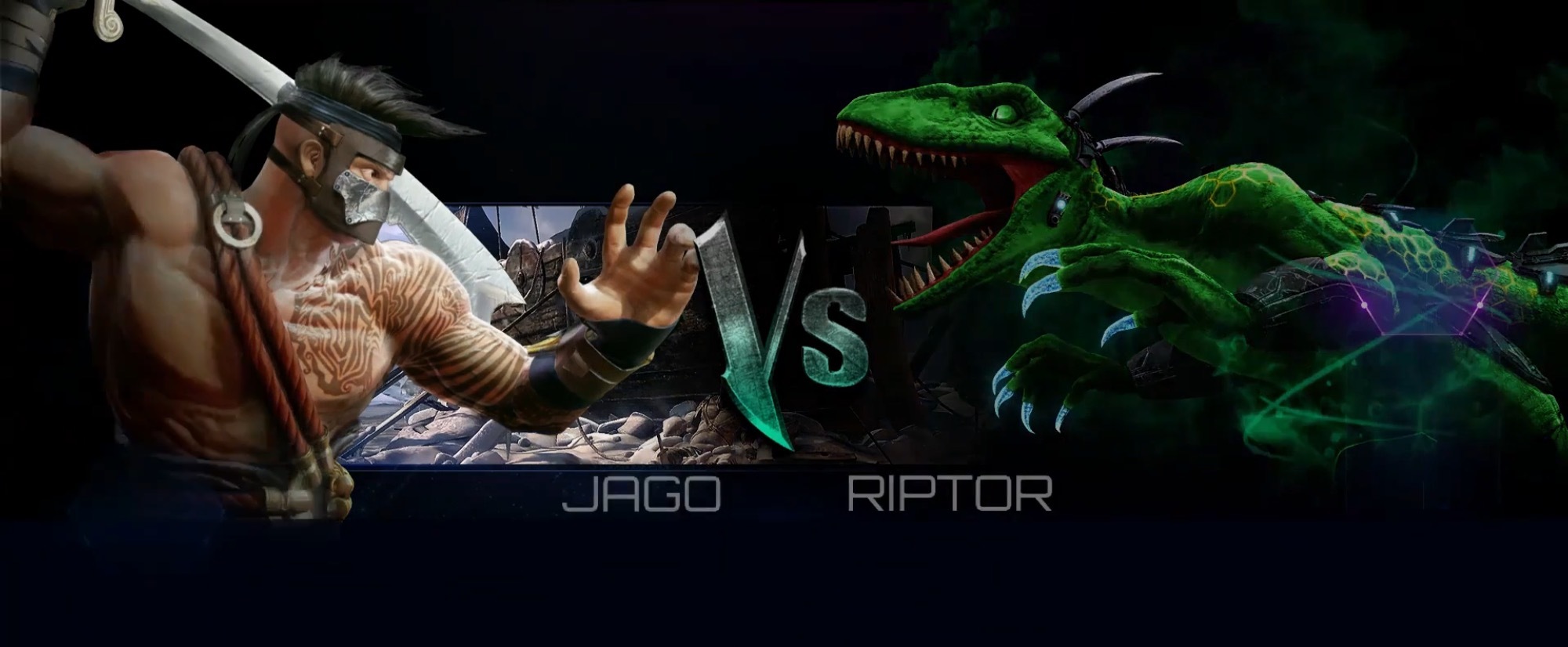
I agree. Only because what we have right now with the 3d models looks kinda raw, and the proportions are off. The select screen we have is nice. It’s just that VS that really needs to go.
I’d actually like that to stay in online play. But I like your suggestion, that space below the characters looks like it needs something. But for offline it should be just like the first imagine.
While I like the idea, what about all of the colors/accessories? Will they have to make a hand drawn image of every single possible combination? That might be asking a bit much, I think. Conversely, if they only have images for the default appearance I would feel like that would kind of be a step backwards in terms of design. Sure the little nitpicky things will be gone, but is it really worth losing the ability to show off your custom appearance? I don’t think so.
I like the versus screen the way it is. Although it would be a nice touch if you were able to switch it to the old versus screen. I liked that one better than this one.
Really? You’re worried about customization when this screen is only seen for 5 seconds…? I just don’t get it. You have the character select to see the character with its customization and then the entire fight. I think that’s more than enough. This is why KI looks so ugly. Most of the time people have costumes that don’t match and that is why people can’t take this game seriously since its goofy looking. It’s not Funny Instinct it’s Killer Instinct.
Woah, slow down there, fella. Don’t you think you’re taking it a bit too seriously? KI has never truly been serious, through and through - it’s always had some element of humor involved. The point I’m making is from a technical design standpoint - it doesn’t make sense to go back to a still image when they’ve already put in all of the work to have actual working 3D models already appear.
No ones mad here lol, sorry if you’re taking it that way
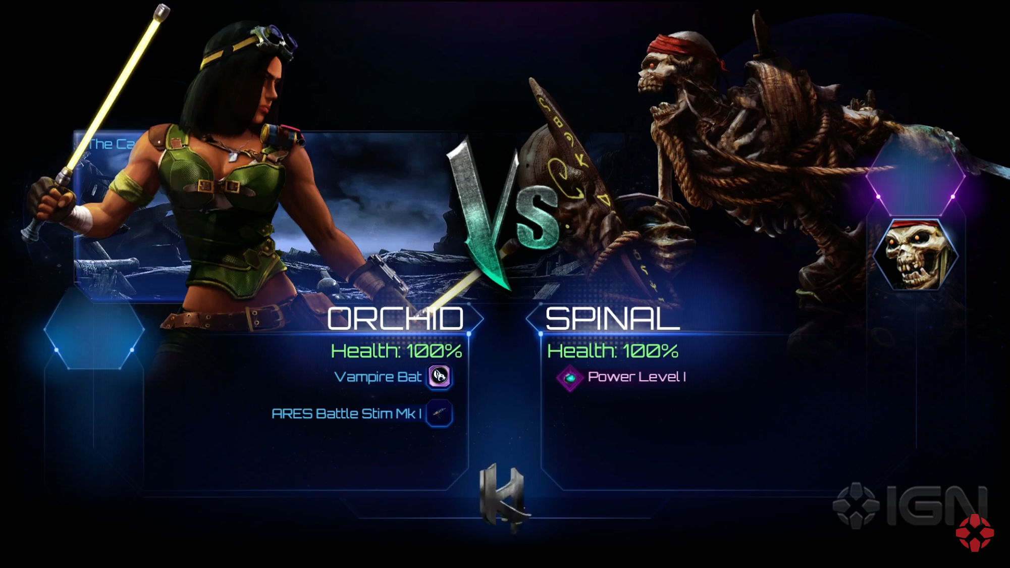
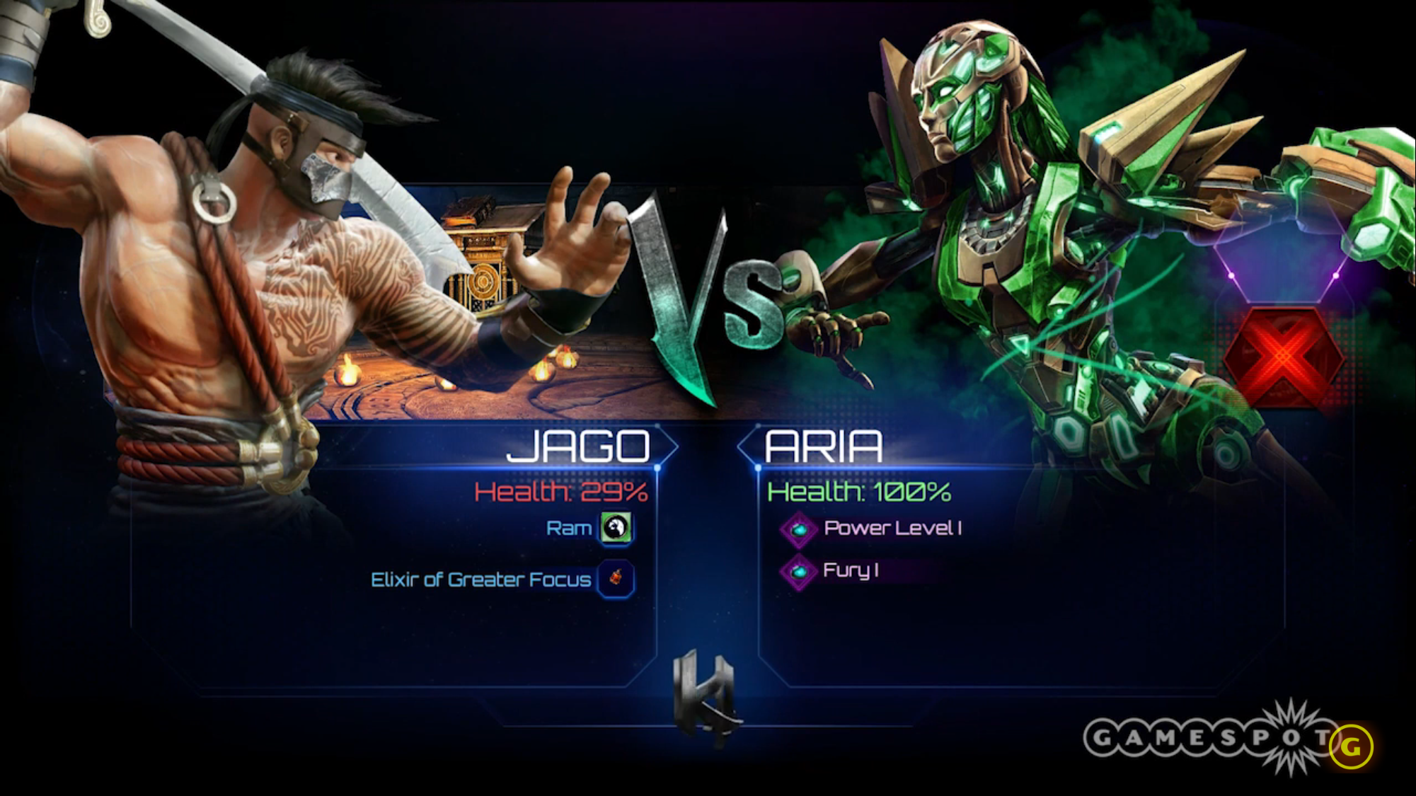
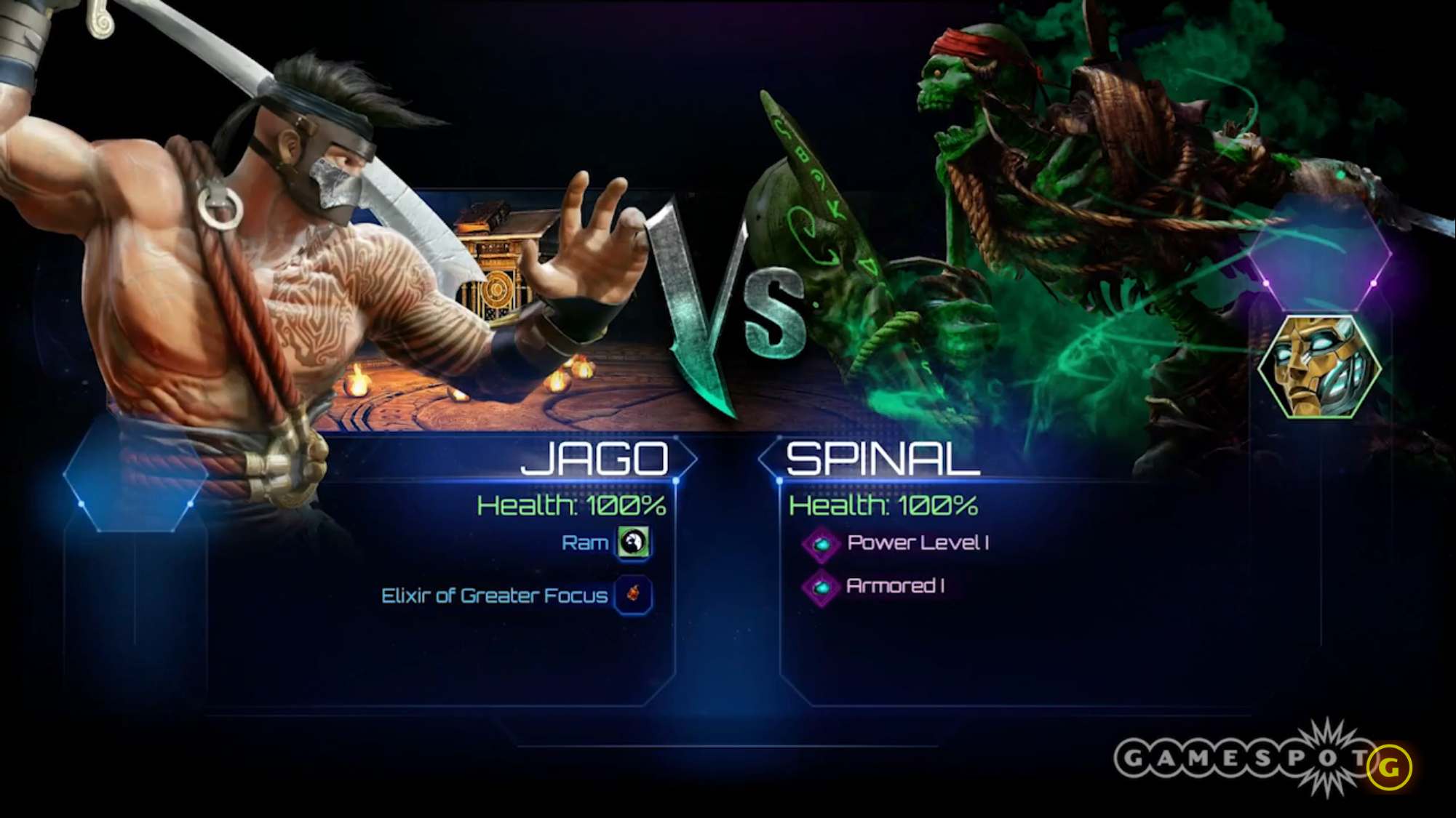
The thing is this game is one big beta version , things can still be changed. Sort of like the shadow bar, the shadow effect, the UI changes, and the character select screen animations. In this case you seem to be one that constantly uses costumes, I rarely use them so I see where you’re coming from and you should see where I am as well. But 5 seconds is not worth making endless possibilities for the character artwork, maybe just have 3 for every character Default, Retro and Mimic.
You still have 99 seconds to show off your skin in a match or maybe even more time. But could it improve loading screen times? Maybe, and you know sometimes the game struggles to show the 3D model in the versus screen. It’ll say “fight on” and one character loads but the other takes a little longer. It’s just the little things that make it stand out… in a bad way. For me personally
I think this screen works better in Shadow Lords than standard VS, personally. It shows that it’s something unique, since it’s the story mode. Allowing for character dialogue in little subtitles and such seems more fitting here than in Ranked.
Plus, there was probably a decent amount of time sunk into the VS screen intros/animations, definitely more so than the still images (hell they even added new ones for the select screen to make it more dynamic). It seems counter intuitive to get rid of them entirely.