Suggestions on season 3 character select screen

Since the roster of KI will be bigger than ever, what about the slots of the character select screen being like the hexagons following the same pattern as it apperars through the entire game hud? Something like this:

and of-course a chaotic background just like this:

We can give more ideas so pls share all of them!

1 Like

Hexagons look a bit too disorganized plus S3. How would you seperate the seasons? 2nd one could work with some more Gargos influence.

I’d rather see the whole character animated and walking to the screen like MKX

The static photo is last gen even KI 2 had animated 3D characters

Theses subtle things help the IP progress.

See SFV Character select.
See MKX character select
See Smite character select
See Soul Calibur 4/5 select

1 Like

I kind of like Season 2’s UI but it needs something a little bit more. The format is fine. It is just lacking the suspense. I think keep Season 2’s layout but change the background. Once you select the characters,they walk away as a cloud of smoke appears and the stage select menu pops up. Once the stage is chosen,the smokenis cleared up with the characters walking into their positions with the stage as the background.

1 Like

I hope it’s more like MKX.

As much as I LOVE SMITE, I often get lost in trying to find a certain Deity.

I miss the scrolling select screen.

1 Like

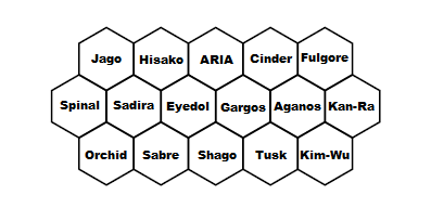
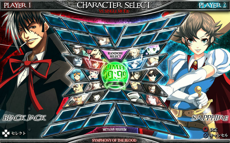
I’m honestly not a huge fan of the honeycomb style, but if they intend to keep it for season 3, then yeah, I think it’d work well for the select screen. Each row could be a season.

As for the top 2/3rds if the screen, I really hope they go all out in the style department while somehow improving functionality.

It’s a tall order, but I’m really hoping they can completely eliminate the curser lag and drastically cut character appearance load times.

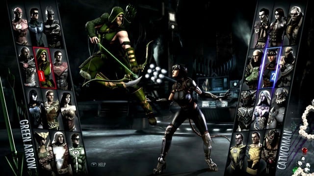
I love the style of MKX’s character walk ups, so some sort of animation in that regard would be cool. I don’t need the walking away post select part though.

I’d like to start out with a static picture of the character highlighted, once you select the character, you can pick your accessory set, which is overlaid on the character image (i.e. The image is switched) and then the color is selected and overlaid.

Once both characters are selected, the bottom 2/3rds (the character thumbnails) drops out of view, the pictures explode to reveal a brief KI1 style Vs Screen vignette like a camera quickly panning through a forest, a metal gate, up Sabrewulf’s castle and to the balcony where he’s howling at the moon (for example).

As this is happening on both sides of the of the screen for each selected character, a large “V” is burns in to the screen in the middle bottom 3rd of the screen and metallic versions of each character’s name come in from each side as the announcer says “Fight On.” The character vignettes end with each character looking menacingly at the other.

Now, I know the static picture in the beginning isn’t overly exciting, but I just want the act of selecting everything to be as seamless as possible, and it seems as though loading those 3-D character models taxes the game something fierce.

If they can do the 3-D models and have the walk up or something similar to MK, perhaps something more unique to KI, then great, I’m all for it. I just don’t want to sacrifice functionality if it can be avoided.

I hope the character select screen is smooth and does not feel like it’s lagging when scrolling through the characters (usually a normal thing in fighting games but I am waiting two years for this)..

3 Likes

I like the Hexagon idea, but I think we should warp them a little. Maybe make them taller in a sort of “portrait” style and display more than just the face in each hex, kinda like Injustice: Gods Among Us but in a more “rupee” looking frame.

Or, turn the Hexagons on their sides and flatten them a little. Like this
https://i.ytimg.com/vi/cn8vlec4Pu0/maxresdefault.jpg

Might look a little more stylized

Wondering if any random morning meeting at MS produces exploration like this.

maybe Max made a difference

We will know soon!

I want smooth character scrolling and better load-in times of the characters. This really needs to be better!

Furthermore a preference would be to have the 3 seasons blocks at the bottom of the screen, with the characters above them. If they keep it in the middle it will end up really crowded looking and small.

i doubt they wil use the hexagon style. thats ultratech thing and season 3 will be all about gargos and etc. i think they will overhaul the entire HUD and make a new one that feels like a gargos sorta thing

1 Like

Did they say anything about S3 characters’ selection screen? Any hint?

So long as it’s clear and easy to navigate then it’s ok with me.
A grid style is most likely although it would be nice to see something cool/unique.
When it comes to layout and shape, there’s all sorts of stuff they could do.

2 Likes

They need to add Kinect functionality to the character select screen. Let us say which character we want! This thing is just sitting there since literally no game has used it since mid 2014. Heck, you’d think Halo 5, Microsofts flagship series, would finally put this thing to use but nope.

2 Likes

Maybe they finally listened and designed the character select to reflect influence from these other greatscreens

Who knows

That would be great, if not for the fact that voicecommands dont work on my dutch dashboard…
They dont seem to see the need to include the Dutch language (which, granted, isnt big worlwide), but those ■■■■■■■ dont even trust us with the English voice commands, while over half of Holland speaks decent to good English, especially gamers…

Dont mind me just venting some frustration.
Love a lot of other things Microsoft does, this just isnt one of then…

best one i’ve seen here so far… It can be a good inspiration for season 3 UI/character select screen.

How about this:

But with uniquely styled frames, and 3 sections. Season 1 on the Left, Season 2 on the right, and Season 3 at the center. Characters would be displayed between segments.

1 Like

I liked it in the injustice game, cant really see it working with a season in the middle though…

I think they either need to make it one big whole, with all the characters, but greyed out characters for the ones you dont have. Or they need to make three blocks on the bottom with the chosen characters above in a cool pose…

In the end doesnt really matter what way they are going to put them, as long as the whole looks stylish and a bit more big budget, with no delays to the cursor or long load times for the characters to pop in.