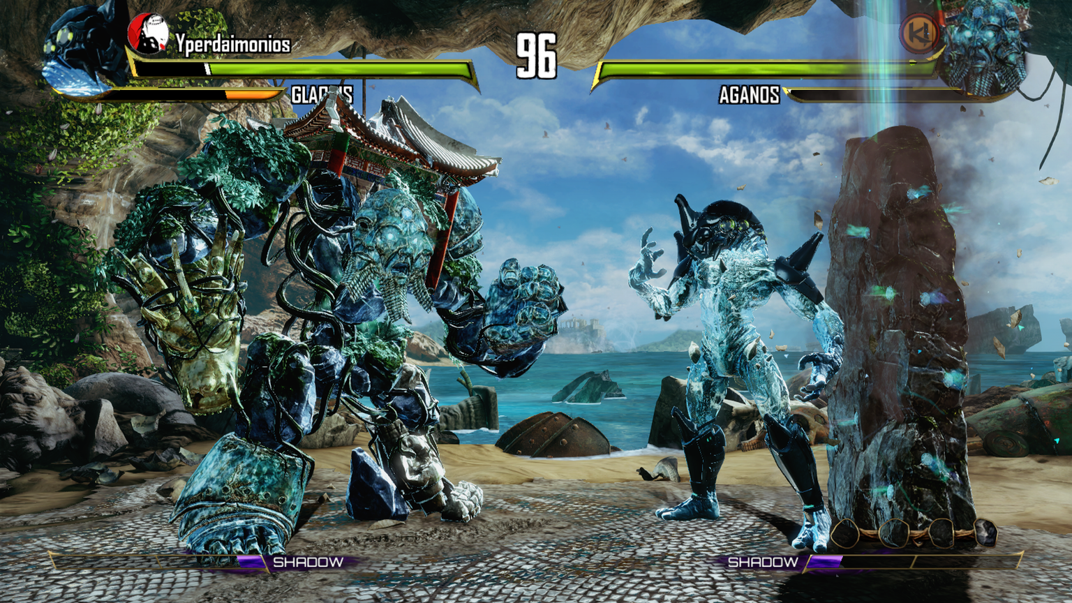
Guys I think there are some issues there…due to very high contrast all the metallic accessories get burned and all the other parts look metallic.it happens in all the sunny stages. glacius’s parts normally are white. look at the difference between Aganos’s rocks and the background ones.
Everything is at the same level, they need to work on that. I prefer the old style if you ask me, to much unnecesary lights and everything burns my eyes =(
The lights in Fulgore’s stage looks too bright, at least on pc. Everything is white, looks awful.
imo in xbox new lighting is glorious.all stages look fantastic( only take off the candles in sabres stage. but its ok.). just some characters have problems with the sun.solid materials are great. metals and stones do no react really well. they need some more work.
Yeah a bunch of accessories and character’s look off at times based on the stage. I hope they still plan to continue doing polish passes
Agreed. First time poster here. Glad to hear you guys talking about this. No argument that the new stage lighting offers a welcome increase in drama and thickness of mood; however, it was just the first step in a process that I hope to Gargos the devs continue to its logical conclusion. The lights affecting the characters, as well as the material settings for the characters’ themselves, are just not quite there yet. The dynamic range is too high, the angles of origin are implausible, reflective surfaces are reflecting undesirable colors, the skin on (most noticeably) human characters is sometimes inappropriately specular (they look oily or metallic), and those old canned ground shadows make no sense at all in most stages now.
MaruMDQ is right. It seems like all of the realtime directional lights are of equal brightness (in the Aganos stage above). They need to back off and leave one dominant over the others. They need to use ambient light to fill some of those hard shadows.
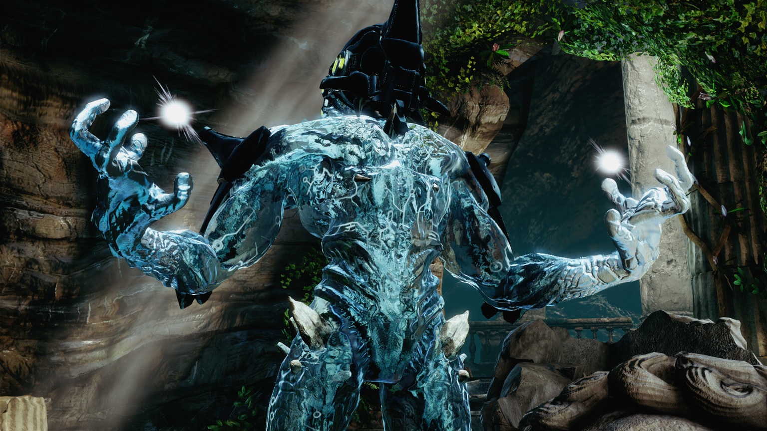
On the other hand, as Krauser5 points out, you have Fulgore’s stage, where they have one super bright light from below. This would be cool except that the characters are standing on an opaque platform. I totally appreciate the art team’s desire to make the environment more dramatic, but the resulting setup is unconvincing.
1 Like