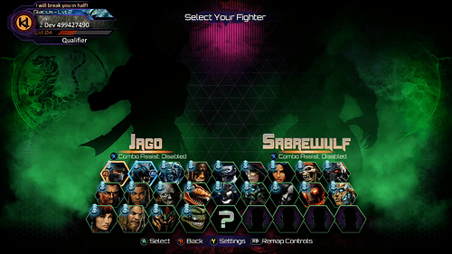
I’m not sure if it’s in IG’s immediate plans given what they’ve shown so far, but is there a chance they will make a unique menu interface again like what they did when going from Season 1, with the simple red background and interface, to Season 2, with the “Ultratech” inspired octagonal, blue and red cyber interface?
Right now with Season 3, it looks like they are keeping it the same but instead of blue and red the color scheme is now green and purple. I know in some early interviews they said it was to reflect the overall theme, the rise of Ultratech, so I’m wondering if they will once again change it based on a new theme for S3
I think there are other UI adjustments but I don’t know that they will be as radical as the changes between s1 and s2.
@rukizzel said something about posting a “UI blog”, where is it? 
That was the day the site went down and I lost it all. Still working on it again, but the stream took precedence on Tuesday, and the Pricing blog yesterday. Today we’ve got the BTS Tusk’s music piece…and the full Tusk trailer with tease.
I’ll sneak in the UI blog when I can for sure!
9 Likes
Oh, man, I know how it fells when you writing something and then, BOOM! You lost everything that you was writing and have to start all over again! 
So… “Creating Music of Tusk” and “Tusk’s trailer with tease” today? YEAH!!! 
1 Like
The purple and green indicate the rise of gargos. Who is the main guy of the season
1 Like
I love the new select screen! The black silhouettes, the individualized character walk-ups, the green mist and the character symbols. Just awesome. Only things I’d love to see is a black KI logo with a green border in the middle, perhaps with mist around it as well. I’d also like to see them go away from the hexagons. Maybe have larger squares or rectangles. No big deal on the second part though.
Also love the stage select screen. Very stylish, very easy to use and very well done overall. It’d be nice if pressing Y actually overlaid the music tracks on top of the arena pictures somehow, with the characters missing arenas perhaps still listed at the top, rather than having to scroll through such a giant list. But that’s a small nitpick.
There are really only two things I’d love to see IG push on either during season 3 or after:
-
The Fight On Screen: Rather than recycyling the old character select intro pose for each character and having the selected background behind them, it’d be really great if there was a sequence for each character similar to their season one dossier sequence or original arcade KI’s sort of cinematic looking sequence on this screen. Something dark and relatively quick, that you can watch as the stage is loading, if that would be possible.
-
The combo fonts. They don’t match any other font style in the game. If anything, they look like they belong with season one, and most of that stuff has been purged. I’d love it if the combo fonts matched the awesome/supreme victory font. I suppose this is more of a HUD thing than a UI thing, but it still goes to the overall presentation.
Anyways, I love the new changes and I really hope there are some more upgrades in the future, because ya’ll just keep making this game look better and better and I really appreciate it!
Just posted this in suggestions, but I’m hoping for a screen scaling adjustment like some other games, such as MKX have. I get overscan on my TV no matter what.
Have you tried TV mode settings? I find most TV these days should be set to “fill” in order to not get overscan.
Thanks for the reply.
Yes, I have. It’s an LED DLP which is getting old, but still has fantastic colors and is serving me well. I’m pretty familiar with all the settings at this point and have been through all the scaling modes available on the TV. The ‘Just scan’ mode available when a 1080p source is connected is the best option there is for minimizing overscan, but still cuts off some, unfortunately. The games that have the scaling option take care of the issue. I guess I’m in the minority in terms of this issue now, but it’s really nice when games do have this in the options. I was happy MKX had this as the life bars are pretty close to the edges. It’s not just an in-match issue though as it applies to the whole image elsewhere too.
I have the same problem! I created a topic about it on the forums awhile ago and never got a response but this has been a big issue for a lot of Xbox users. Nothing wrong with my tv settings but it has overscan issues. Every other system on the market has the option to manually customize screen size to deal with overscan except Xbox. I’ve even spoken with people at Xbox and no one can tell me wether they ever plan on implementing this feature.
Here’s a link to the Xbox feedback page regarding this issue.
https://xbox.uservoice.com/forums/253802-home-xbox-guide-and-settings/suggestions/6234419-underscan-or-overscan-settings
Don’t expect Xbox to do anything about it seeing that this topic has been up since the release of Xbox one. Just gotta pray developers add the option into their games.
All the work is appreciated, dude.
