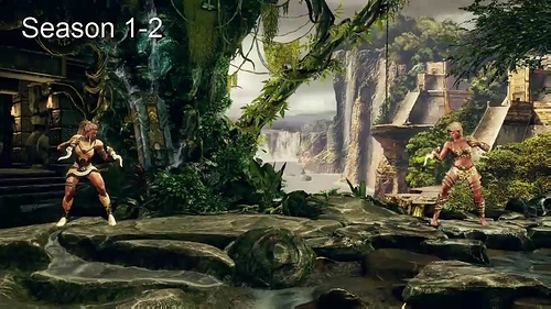
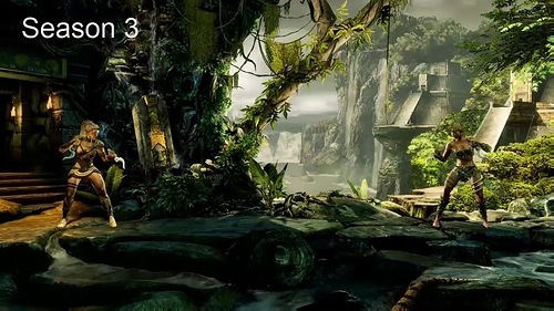
She always looked good, she just appears to be extra shiny, and you can see teh street light reflections on her too.
Totally disagree. Game looks miles better now, so many stages I always skipped that I love now. Sadiras stage went from one of the worst in the game to maybe the best.
What? Darkening? I don’t even know what you talking about shrug
The only thing that looks ‘bad’ in KI are the overuse of particle effects – too much and too frequent. When the game is at its busiest (Fulgor’s stage + Spinal mirror mode), it’s all too much and borderline migraine-inducing. I actually manually select stages now, as cited stage is just an eyesore. (…as true to its desired theme as it might be).
Using these admittedly impressive effects sparingly is the key. Kinda like survival-horror not throwing rotting zombies at you every second and canned jump-scares around every corner – moderation.
Gotta agree. Some stages are really dark, crushed black as you say, others look great. I even had to up the lighting to 3. But I will say it looks overall night and day better now. So much clearer and prettier. The new lightning improved things massively. As someone said above.. Sadira’s stage… wow. Was eh before, now it’s gorgeous.
I can tell they have a better lighting system, but when you go and purposely make everything all black, it kinda defeats the purpose. This video shows exactly what I’m talking about. https://www.youtube-nocookie.com/embed/XvjpHOmM1HY I think people mistake different for better, a lot of times.
I think everything is brighter, not darker… in a lot o cases Thunder, Fulgore, and Aganos’s stages look washed out.
I had to adjust the lighting to -3 for season 3.
Also a lot of texture detail is lost on all stages, less reflections, and I guess wet characters are no a longer a thing for thunders stage. I’ve only used Season 3 characters, but none of them have a wet effect on their skin when you ultra on Thunders stage.
Sadira’s stage is just horrible BTW… you’re in a CAVE it shouldn’t be all bright and happy looking.
I love the game, but the lighting is a downgrade, not an upgrade.
So many people were complaining about the game not looking dark enough like season one and they go and relight every frickin stage and they look amazing and now people say it’s too dark.
I get that you can’t please everyone but man… This board is getting ridiculous lately. Like everything they do, every change they make, there’s new people coming out and saying they don’t like it or asking for a toggle.
Maybe they can relight the stages again for season four so the people that complained all through season two about missing that dark season one magic can rise up and take a verbal squat on this board again.
Not the most constructive post, I know. My sincere apologies.
Side note: I love the particle effects in this game.
I’m overall ok with the stages, some texture is less noticeable now but whatever.
The major problem is on some characters: you can’t show me something which should be white, in black (like TJ Combo bandages, Glacius metallic accessories, etc.), and make a character completely pure black if he has black parts (Shago color 9 lower body).
Like I said, TJ Combo white bandages are appearing correctly if he faces left so it’s something wrong in the system, I mean, they’re black if he facing right…it’s not a question of general darkening.
This forum is made so that people can communicate with the staff and I’m communicating that somethins is not working as intended…at least, I think it’s unintended that white is appearing as black due to new lighting.
I know, I totally understand that and my little mini-rant above wasn’t intended for people that find things that aren’t working as intended. It wasn’t even for people that simply have opinions, I guess. Apparently I was just blowing off some steam. Sorry about that.
It just seems as though this forum is sometimes playing developer whack-a-mole, where people yell and complain about something, the developers fix it, and then a whole new group comes out to whack them because now they don’t like that thing. Of course, that’s just human nature and everyone has opinions. I get it. I guess it was just a knee-jerk reaction on my part.
When you see enough people say “KI needs to be darker like it was in season one” or “IG doesn’t get the soul of KI, this game isn’t dark enough” and then they undertake this seemingly large-scale stage relighting and bring out more detail while making the atmosphere darker in many levels and people come back with “ahh it’s too dark, everything looks saturated, I liked it before etc.” It just makes me cringe a little and it makes me wonder if they’ll just stop listening to fans at some point if the general mode around here becomes one of constant dissatisfaction.
Obviously, constant praise isn’t valuable either, as they can’t really do anything with that feedback-wise. It just feels as though sometimes the board has a decent balance and sometimes it doesn’t. I guess I should expect the latter a bit more when they release content and people can dive in to it, but it also seems to happen when they show content pre-release, or even when they don’t show content. I dunno, maybe I’m just reading too much in to things.
The colors seem a bit oversaturated to me now.
The revamped stages are perfect, the new lighting is superb; it’s the effect this new lighting has on the character’s models that’s not as smooth as it should be, causing their skin to become too dark or bright on certain stages (for instance, Kim Wu’s skin becomes black in Tusk’s stage and the same happens to Sadira on her own stage, whereas retro Tusk gains a pale, dead-like appearance in Glacius’ stage). And in some cases, the colors are so vivid that the character almost blends in with the colorful surroundings.
Perhaps now they should apply the same treatment to the character models? It kinda feels like KI Gold now (where the 2D models didn’t quite blend in with the 3D backgrounds)
Yeah, my friend, it’s the internet era everyone is ready to praise pretty instantly for anything, you’re right about it.
I tend to ignore ranting topics, I trust IG and I’m positive that if something gone wrong they will fix it (as I said before, if there aren’t statements about these “problems” I can’t know if the effect I see is intended or not, but side changing colors seems unintended to me).
TBH I never saw topic asking for a darker image, not much at least but I can be wrong.
Onestly I have only two things to say about the whole game:
1 - strange lighting effects with some combination (character/accessories/stages) started only with S3
2 - arcade mode (S1 story style) still missing for entire roster (I would be happy even with a random rematch in VS CPU)
Beside these two things I’m totally satisfied, character design is the best, stages and music are great ant the battle system is well tuned and refined.
I found it odd when I read the article stating that they were going back to the dark look that everyone loved, cause I remember that being the main complaint about the visuals, when it came out.
This topic is conflated by the nature of the Xbox One hardware scaler. When this game launched, the Xbox One hardware scaler made the game look way too dark due to the way that it crushes blacks. As far as I know it still functions identically in that regard. There was a sharpness-increasing post-process effect that they disabled, but the black crush problem remains unaffected. (Apparently there are just too many people who don’t understand what they are looking at. Or worse, they prefer crushed blacks during the first 5 seconds of an A/B comparison. These are the same folks who used to tell everyone online to indiscriminately set their brand new Playstation3 to ‘full range RGB’ because it “looks so much better.”)
Like Hayabusaslice, I was a bit taken aback by the quote from the devs about returning to a “deep black” look. I wonder, though, if a lot of the work they did for Season 2 was done with the knowledge that the Xbox scaler was going to alter the appearance of the game for all users. Then, once PC support was announced, the realized they had the freedom to increase the contrast in the lighting setups. In fact, if they hadn’t, there’s a good chance everyone on PC would now be complaining about the game looking “washed out” (which is everyone’s nonspecific go-to term for problems involving a lack of contrast).
See what I mean? Perhaps they had compensated for the scaler’s black crush for Season 2, and if they hadn’t removed that compensation before shipping Season 3, the game would have had the opposite problem on PC.
I totally agree about spinals stage looking worse now . It should be a mix of what it is now , and the ghostly green fog everywhere from before . It looks way too plain now. Also cinders stage looks too flat and dull now . It used to have an awesome sort of neon orangish glow all over.
yeah this is exactly the problem that i have with the game right now, the stages look great (except spinal’s) but the characters look just horrible, is like they have different skin tones depending of the stage they are on.
please fix!
I never thought id say this, but some of the stages absolutely do look better in season 2 after watching this comparison video . Spinals looks worse , cinders looks worse, thunders is worse, riptors is defintely worse, jagos is worse, even arias seems a bit worse. However, fulgores stage looks absolutely amazing now. It’s incredible how good it looks. Tj , Hisako, and Aganos all look great also. But man it’s a bummer that a lot of them look worse, especially seeing as how that was a huge part of the reason we didn’t get 8 stages this season. Oh well, game still looks great overall !
Dont forget Maya’s stage. The fact that it’s outside, makes the crushed blacks even more obvious. For me, there are only two stages that look better, and that’s Sadira, and Kan-ra’s
Fulgore’s looks way better too, but Spinal’s is a big case of “if it’s not broken, don’t fix it”. It looked perfect before. This new lighting is hit or miss, but I bet IG can adjust it as the season goes on.
I agree. And yeah I hope they can . I reeeealllly miss the ghastly , ghostly , green haze on Spinals stage.

