In Game Font UI Universal

Hey folks, I a student studying User Experience and design and have been really dealing into KI’s design stuff and digging a lot of the changes over the course of the seasons in terms of character and UI designs. Something that was bothering about the in game UI once the Shadow text appeared against the meter is that the font is not all over the place. There are three different font types on the game UI, one for the meter, one for the character name, game clock, and user names at the top, and the combo breaker text. I was thinking taking the Orbitron font text used for the shadow and use it as the font for all of the top text. Oribitron has different thickness types so it would not have to be so thin like it is for the shadow text.

The combo breaker and combo text itself is fine, although the combo numbers should match orbitron as well. I think the combo text helps keep the spirit of the gameplay, where its prominently displayed.

I think its important for users to not have to ready bunch of different types of fonts, as it distracts them somewhat form the gameplay. KI is a different beast because most of the time you’re paying attention to the action, but someone actually watching the game played at a tournament level or on a twitch stream might get turned off a bit from the cluster of font styles.

Anyone agree with me on this?
It’s something I’ve been wondering if they’d do for awhile now. Font cohesion might seem minor to some people, but it helps bring everything together as part of the image of the game itself. I’d love for a more standardization of fonts in game like how they are outside of the gameplay parts of it. I still like the rough text of the combo breaker parts of the UI, same with the font used at the end of matches that say Supreme, Awesome, etc.

Yeah, the number of fonts used in this game is excessive. Personally, I’d prefer one unifying theme for the menu font, character names, combo fonts, victory font etc. There are two fonts used on the checking DLC screen alone and they both say the exact same thing.

I think the character design in this game is beyond brilliant, from both a conceptual and gameplay perspective, but the art style and fonts used has been all over the place since season one and I’d really appreciate it if they’d take the time to wipe the slate clean and do all of that over again with one slick, dark, uniquely KI style.

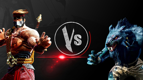
By that, I mean no season2 Ultratech theme with hexagons everywhere or a large season 3 Silver/Purple/Green Vs logo, no season one combo font and different victory font. Decide on something gritty, but stylish, then play off of that one look with various versions of it that still stick to the original thematically so we’re looking at a whole product that feels like it belongs together.

Nothing says work in progress more than having an art style, fonts etc that are all over the place on the UI. They redid the select screen and I think it looks great, but at this point, I’d be okay if they ditched even that and just reinagined all of the menus, every screen from the checking DLC up through the Fight On screen.

I know it’d take time, but after three seasons, I think this game’s UI has really fallen victim to this whole seasonal process. Stuff is not easy to find in the menus, character models are still slow to load, fonts don’t match or adhere to any theme, the video on the home menu being choppy at times, characters getting frozen while blinking, characters hero art loads late on their own background in the ladder part of survival…

I’m sure that IG could make all of these non-gameplay parts awesome and I really hope they take a crack at it. I don’t mean to belittle anyone’s work here, but I do hope this stuff an be improved upon, especially the font issue.

I have to completely disagree.

Having a universal font may be a great method in media like advertising, but not in a video game like Killer Instinct.

The font for the Names and Shadow Meter are thin, slick, and out-of-the-way, because they are not important to the fight.

Conversely, the Font for the combos, breakers, and lockouts, are big and impact-ful because they ACCOMPANY the intense action on screen. Whenever something extreme happens in the game, Players’ and spectators’ eyes are quickly drawn to the obtrusive text that pops up on screen at the same time as the climax in action, and get the information about what happened quickly.

The game is meant to have a huge in-your-face style to it, that CANT be ignored by people walking by. The games major contrast in sound, visuals, and fonts helps it do that.

(When you walk around a fighting game tournament, it is very easy to ignore fighting games that are bland, because all you hear is a boring voice saying “Round 1!”, “Winner!”, and all you see is the usual “2 characters fighting each other” format. But when you walk by Killer instinct, and hear “COMBO BREAKER”, and turn your head, and see Huge explosions and giant “COMBO BREAKER” text, you HAVE to go see whats going on over there :slight_smile: )

I have been saying this over and over again, there is not a cohesive look and feel to the game. As a Designer myself it bothers me that a game I love so much has no consistent brand identity through the fonts, colors, and even in the logo (Different sizes for the KI behind the text on all different products). The problem is IG or MS, doesn’t seem to think it is important and have no plans on changing it, which is quite disappointing. So as a passion project I’m coming up with my own Brand identity for KI; updated logo, menu UI/UX, HUD, everything.

This is the base I’m starting from visually based off of feedback from others, I’m in the midst of finalizing fonts.

1 Like

I have no idea why they keep the old combo font it does not fit in ki at all and even in season one looked bad