Green Mist obscures character colors/accessories

You can’t see the full character costumes anymore! Anyone else annoyed/bothered by this?

For seasons 1 and 2, you were able to clearly see the color patterns and designs of every character. Now, the green mist on the bottom blocks your view of half the outfit. For some characters, this makes it hard to see exactly what character your’e walking onto the stage with. This is especially the case for Jago…

Season 1:

Although the character selection scroll is on the bottom of the screen, the scroll itself is both small and see-through, allowing the player to see as much of the outfit as possible

Season 2:

Here, characters are given their own space on the sides of the screen, allowing the viewer to clearly see what colors they will be representing on the stage.

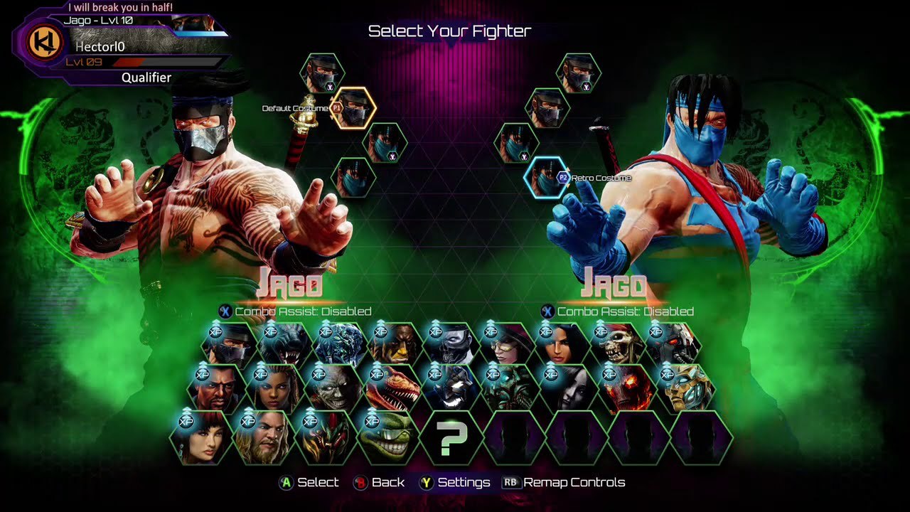
and just to keep with Jago (sry it’s not as big)

Again, we can clearly see that Jago is wearing blue pants here
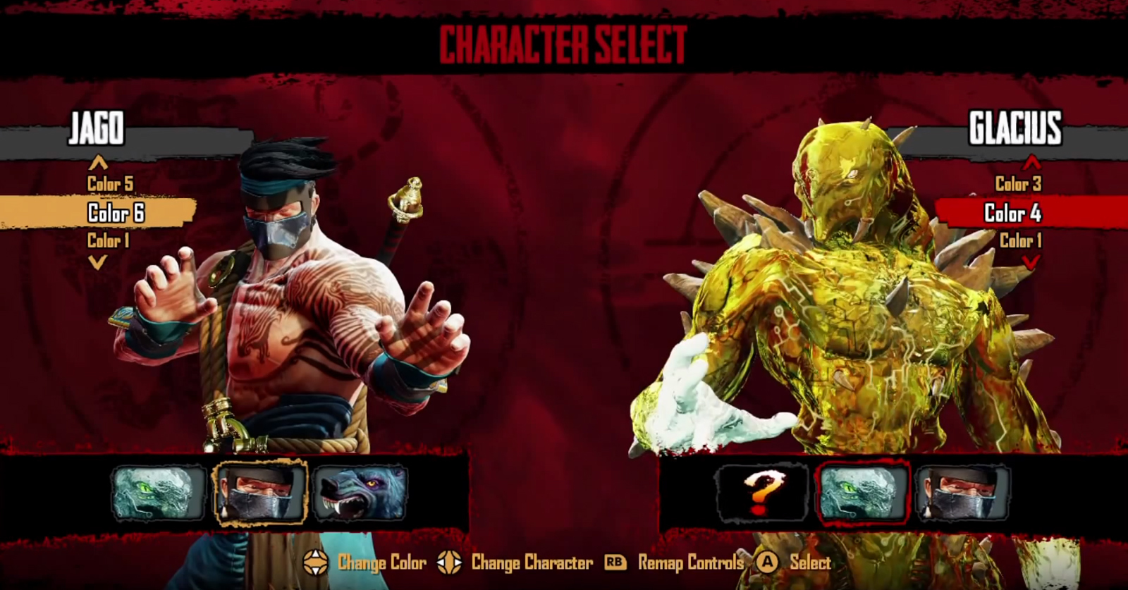
Season 3:

Here, Jago’s colors are clearly obstructed. (Obviously talking about Standard Jago on the left, not his Retro on the right.) If you were a brand new player, or even just someone who doesn’t play with Jago too often, you wouldnt know what color pants youd be stepping onto the stage with…

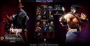
And just to show it’s not just Jago (again, sry for the size):

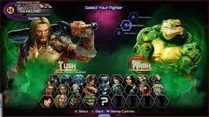
Besides Tusk’s hair, there’s no way you can tell what color you’re selecting…

I suggest that the green mist either become more see through, or maybe not come up so high that it covers half of the character. Or maybe, change it to sort of a band of mist so that the very bottom of the character is visible - kinda like the character selection screen in season 1.

Either that or get rid of the mist completely. Because it’s really annoying not being able to see the colors on some of these characters beforehand.

Idk, what do you guys think? Thoughts? Other Suggestions? Comments?

8 Likes

ya, I agree with you. The costume customization are in sets tho. so what’s on top generally is on bottom as well or a theme as it were. someone feel free to correct me, but I’m not sure if bottom accessories are different from the top.

Anyways, my beef with the game currently is the stand in announcer. He sounds worse and worse with every audio clip added. IT sounds like someone drinking a glass of milk and speaking in a gravelly tone. they need to completely gut it and redo it.

I agree.

The smoke should be behind the characters IMO

9 Likes

I mentioned this to the Devs when S3 first came out in the 3.1 thread. I agree you cant see what color you are changing too and for someone that doesnt play much like my kids…they want to change colors and they cant see it. You have to memorize your favorite color # and thats not cool.

the green needs to be in the back ground only.

I can agree here as well. I’m not familiar with all of the colour options of the characters, and it can be rather difficult to see what you’re getting. If the smoke weren’t there it’d be nice.

I’d also like to add actually seeing the character in the select menu rather than only seeing them when they do their walk forward animation.

Oh wow I didn’t notice this until now lol

1 Like

I guess that does make sense. Maybe they could be stepping out of the fog during the character select animation.

3 Likes

That would look really good :thumbsup:

It doesn’t matter whether you can see the colors or not based upon selection, because the colors are NUMBERED. As long as you know which colors go to each number, you’ll be fine!

Now, in terms of seeing how awesome the character looks, yeah, I can understand how the green mist is annoying. That being said, with Tusk, you said you can’t tell what color he is. Numbers aside, I can tell exactly what color he is based upon his skin-tone and tattoo color, both of which are still clearly visisble, even with the green smoke effect. If you want to know what color Jago is wearing, just look at his headband and rope sash - it shows you which color you’re on, despite the green mist, again being in the way.

I like the select screen BUT at the same time I don’t like it because they removed the original from season 1 which was reminiscent of the original ki with the scrolling to right/left to choose a character

In my case I literally use every character in the game, and I have every character at level 50. I can’t possible remember everyone’s color scheme based on numbers.

1 Like

Didn’t even notice, it doesn’t bug me because I already know what I’m picking so I don’t need to focus on the bottom half of the outfit on the brief character select screen.

1 Like

Re-read my last post; I edited it to show ways to tell what color you’re on WITHOUT using the numbers. :wink:

Oh, and for the record, I use every character in the game too, and although they’re not all at lvl. 50 (I’d say I’m about half way there), I was still able to recognize and memorize them easily enough. It simply takes time and a good pair of eyes. :slight_smile:

I used to have all the characters at level 50 too but then S3 came out and my data took a corruption arrow in the knee lol, but serously some characters you just forget what colors they have below the belt for example Mira’s retro, her legs are purple unless you change accesories to match the colors but the most prevents that.

This is 1 of 3 fixes I would like to see for the character select screen. The smoke in front of the characters is very obtrusive to seeing what color you’re picking.

My other 2 fixes are: flip Hisako so she’s facing to the left since she’s facing the wrong way, and improve a few characters walk-up animations, namely Spinal, Aganos, and ARIA.

The issue I have with Spinal and Aganos’ walk-up animations is that they’re generic forward hops and 2 other characters also do the same thing: Wulf and Maya. I think Spinal should do something along the lines of what he used to do where his bones would come together to form his body and maybe Aganos can slowly walk forward while beating his chest. As for ARIA, hers isn’t bad but I think it can be improved by having her fly forward slower to maybe make her look more graceful.

That scheme would be incredibly tedious given the size of the current KI roster. When there’s only 8 or 10 characters you’re never that many presses away from having your selection, but when you get to 24 having to scroll 12 times every time because your character happens to be in the middle would be super annoying.

1 Like

Hisako is not “facing” the wrong way. Every character has their EYES looking towards the center. It’s just that Hisako is the only character where her EYES aren’t in the same direction as HER FACE. Does what i say make sense?

So look at her arms or the massive jewel in the middle of her forehead - they match the legs you’re talking about. :wink:

1 Like

I’d rather him “unfurl” as if coming out of a natural disaster. Small at 1st, and then you see him become massive as he enters and uncurls into the foreground.

1 Like