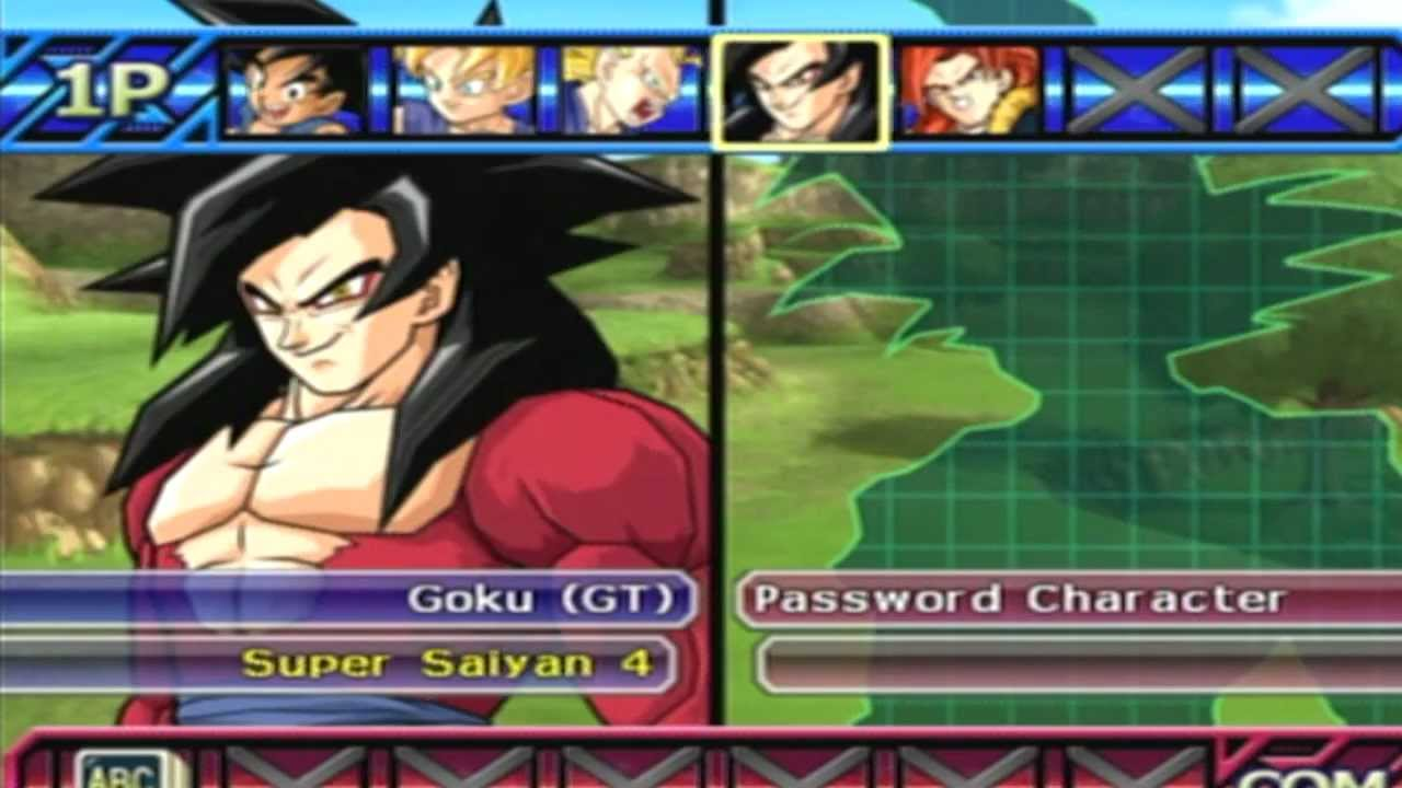
I feel that going back to the classic style would fit best. With the amount of characters in season three a traditional tiled select screen like most fighters is not better. To get from Glacius to Maya takes four moves, with my suggestion most people will say it will take six moves, however I think they should add a quick select that lets you jump from one season to the next with one button, meaning it will take only two moves to get to Maya but really its application will really shine when going from Glacius to a season three character. This will make the season three select screen unique from other current fighters and also reference classic Killer Instinct, as well make it easier for people to reach season three characters from a season one character.
The good old scrolling slots. Simple and much more organized.
This solution is clever since the characters are organized wholly by season. Moving up/down could switch between the 3 rows so that it resembles classic KI and Season 1 character select.
I dunno, if you’re going to have a button, why not just have a grid that’s three rows of nine characters each?
What’s the advantage to having one long row and you jump to a season with a button press? Plus newbies will have to remember which characters are in each season…
I like the idea in theory, as it lessens space used on the screen. But who’s to say three rows of nine would take up so so much more space that it prohibits them from doing something with the visuals that they’d be able to do when there’s only one row?
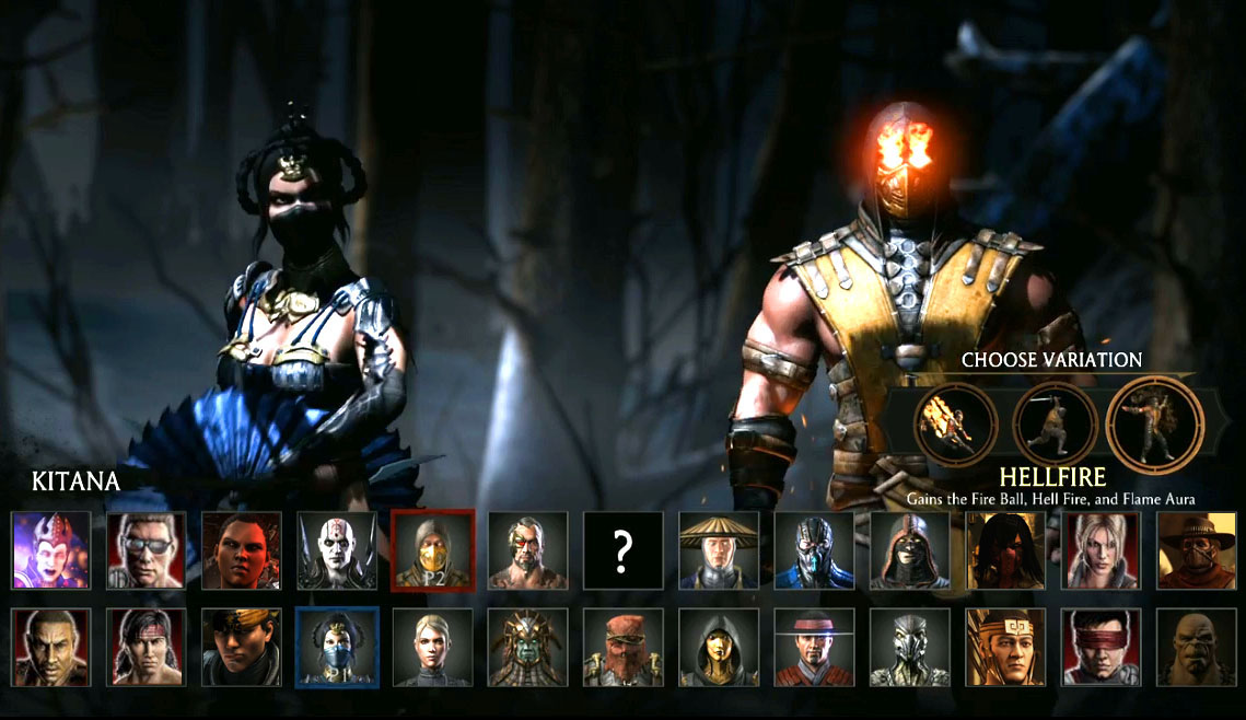
Personally, I think MKX has a really slick select screen. Something like that could look really cool in KI.
Yes Three 3X3 Grades for each season its more better and easy
But.. like this:
- 2 Characters Select Bars
- 1 Up for 1P and 1 Down for 2P
- Scrolling Up and Down for changing Seasons
is great too!! ![]()
Because if there its three 3x3 slots then maybe the characters will be more small than usual on the screen.. ![]()
This is one issue that I don’t agree that “classic” is always better, I’d rather not scroll sideways though three whole seasons of nine characters. I think a large grid like we have now works quite well, maybe move it horizontally and place it at the bottom or top of the screen but I’m not a fan of the ol’ wheel of characters thing.
A draw back to your idea is that you wouldn’t be able to see every character at one time but It would definitely look cleaner tho. I do like that the season 2 grid takes up the middle of the screen that was mostly dead space in season 1. Maybe a vertical version of your idea could be pretty cool.
I don’t care what it looks like but please fix the lag already! It’s awful. If the system can’t handle the full renders then use still images or artwork or something.
Sorry, but I completely disagree with this. I really like the 3x3 grids, and it is a lot easier and simpler (minus the current Character Select lag) to move around and select a character with the modern grids. The scrolling character bars could take a lot longer to find the character you’re trying to select.
Plus, being able to see the list of characters in each separate season is awesome. They could easily move the grids around to give us three grids side by side.
Personally, I’d like to see the 3x3 grids horizontally at the bottom of the screen, but have them connected to one another so it’s one complete rectangle. Just have a pillar in between each season denoting Season 1, season 2 and season 3.
The current arrangement looks odd because they’re almost set at an angle, where the top part of each box looks smaller than the bottom part. Just make everything the same size, put some style and flash in to it and have that part take up the bottom 1/3rd of the screen. As an aside, it’d also be nice to see each head look up when the curser goes over them ala KI Gold.
Oh yeah, and as to what was said by @maxx747, IG really needs to get rid of the lag. Completely. Not just improve upon it. But eliminate it. If that means getting rid of the 3D models for the characters on the select screen, then so be it. Use 2D pictures. I don’t need the accessories and colors loaded on to the picture either.
Just let me choose form a color swatch menu and an accessory menu of six pre-loaded accessory combos that I’ve chosen. If I want to see how they look on the character model outside of gameplay, I can go to the character menu where I choose the accessory combinations currently.
Don’t like the idea of hiding the roster in a memory-tape style retrieving method.
A circle made of hexagons can make for a clean screen of 24 or so characters as to not hide the game’s treasures.
That would indeed be beautiful.
Yeah, I’m pretty sure the system they are using is better. One of the key reason that character select was okay was because KI has historically not had many characters in a game. If S3 drops 9 we will have more than double and almost triple the number of characters for any previous game in the series. I think SOME kind of grid is the only viable solution. Really, if you look at the solution they are using now is it difficult to find your character? I just wish it wasn’t occasionally laggy.
Only thing I worry about with a circle made of hexagons is that it’d likely take up a lot of space no matter where it’s located. If you put it in the middle of the screen, the bottom… Pretty much anywhere, it’s likely going to be awkward to put other stuff around it. At least from how I’m envisioning it.
I suppose Darkstalkers 3 did it this way, if I’m not mistaken, or perhaps MVC2 (getting my games comfused! lol), and there was enough space for characters highlighted, but I don’t recall it being a horrible amount. Think the characters were relatively small and there wasn’t really any space on the screen for anything else.
I’d still think that squares within a rectangle, placed horizontally at the bottom of the screen, would make a good deal of sense and still leave a large amount of space above it to put the character highlighted, color menus, accessory menus or whatever else would be needed.
Man… MKX’s select screen is so slick. LOVE IT! If KI could do their own spin on this, perhaps rolling clouds and lightning instead of the forest, with a spinning KI logo between the characters… That’d look pretty awesome. Have the “choose variation” part be where you select colors and accessories…
Well, okay, guess KI shouldn’t blatantly rip off MKX lol. But something along those lines could look really cool!
What will be cool in KI is the animations of the characters in MKX when you are chosing them
I agree with this. Similar to full motion videos like the original KI.
The only real problem I thiink I’d have with them coming back is it will take longer to find the character I’m lookijn for, especially with so many characters as it is. However If they can make it so it comes out smoothley instead of how it functioned in season 1 I’ll be up for it to come back. Be good to see it again.
Or let you customize it the way you want?
that’s a good idea ,people love to customize ,that’s why metal gear solid 5 right now is so good you can customize and build your military base, colors emblems ,logos, horses atirre and color,your dogs attire and color and your vehicles etc ,its all customizable.