I do i love EVERYTHING about it. 100% satisfaction good job IG.
1 Like
Ok so i was just happy with the new design, yet as you all are discussing, so many other things to think about with a select screen!!!
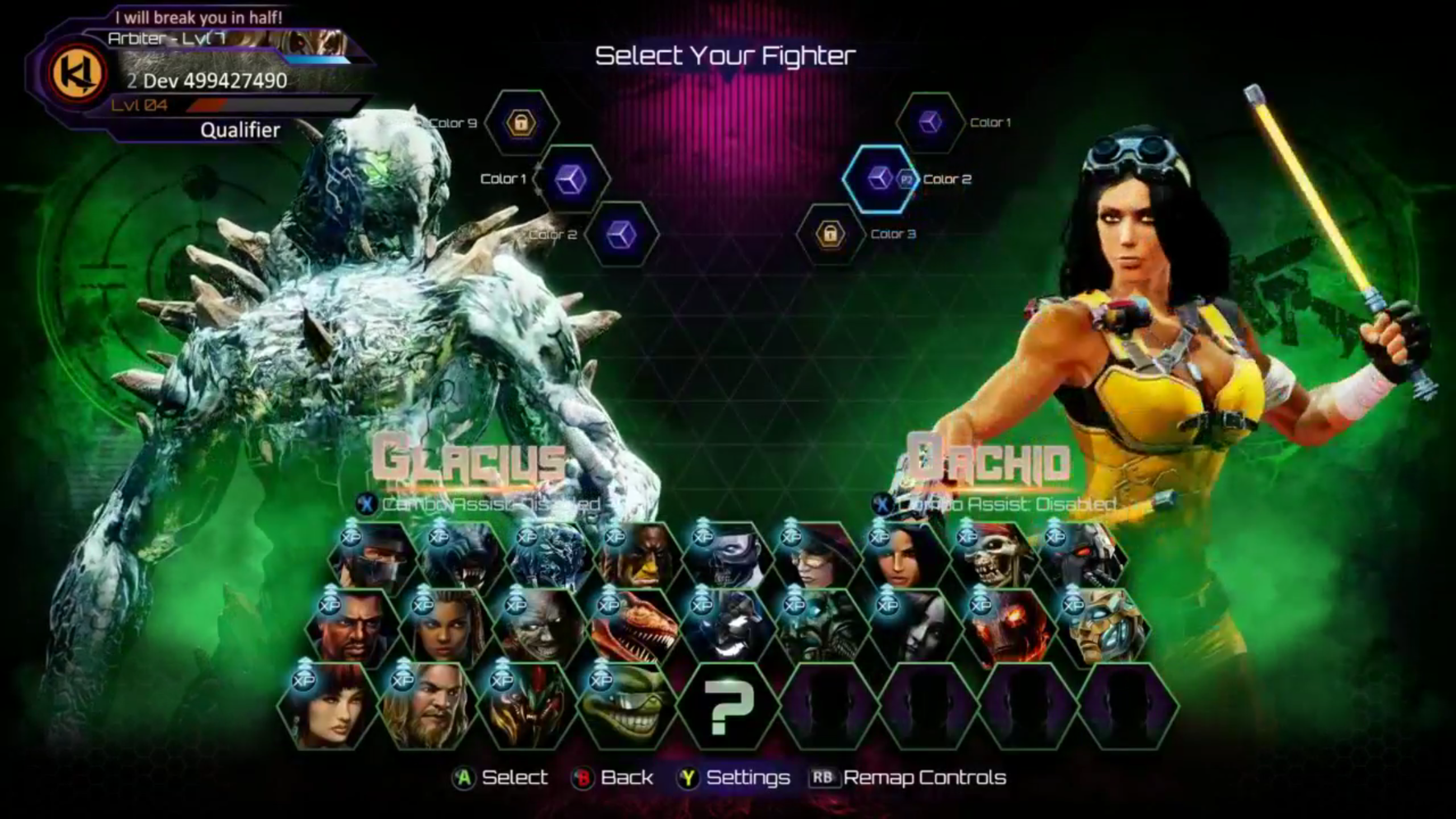
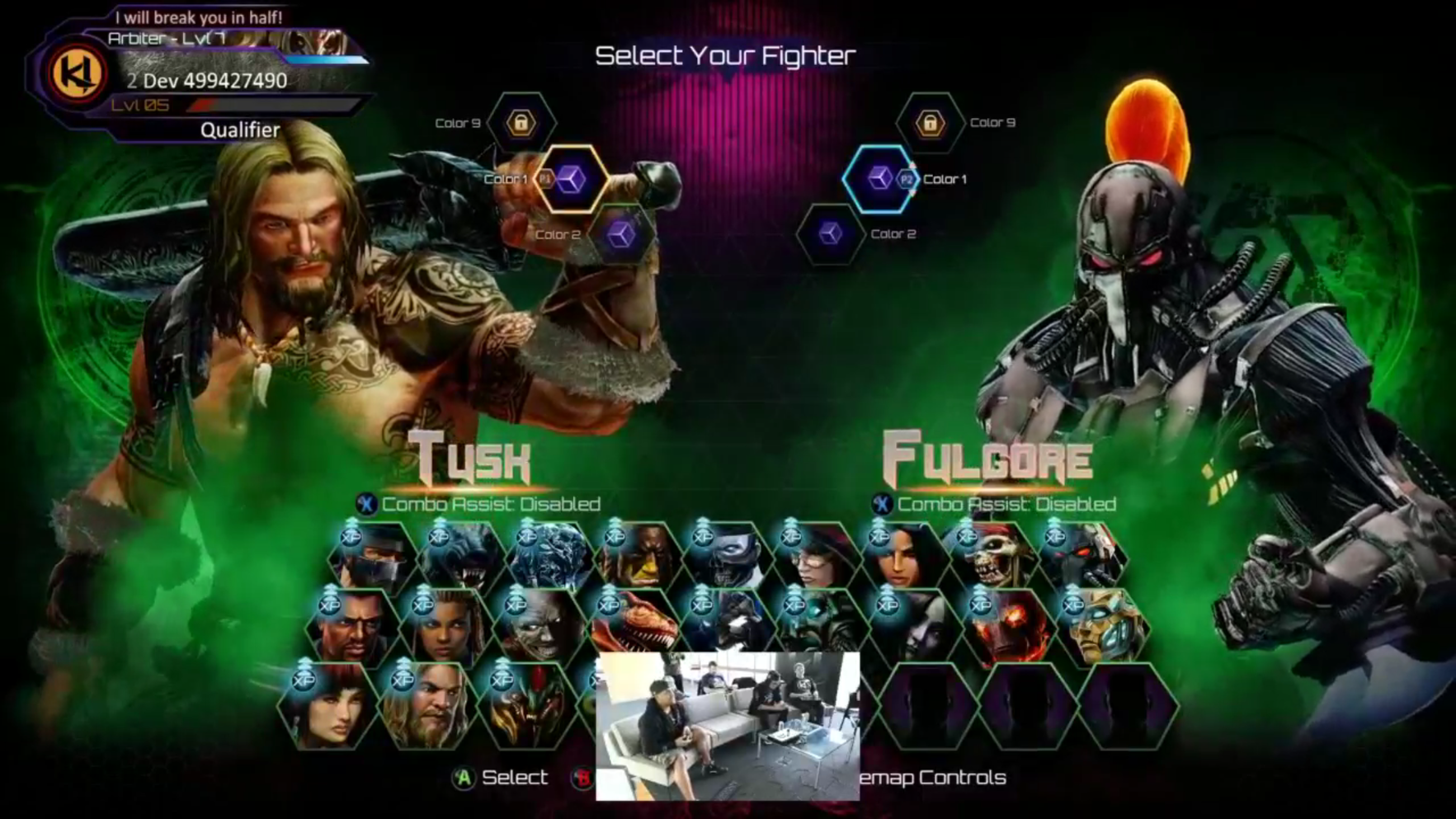
I also love every single thing about it. The colors, everything is fantastic . The neon green and the magenta surprisingly work flawlessly together . I’m not CRAZY about all the triangles if I had pick one thing to change if I absolutely had to. Some lightning would be great . The shadows before the character moves forward doesn’t bother me at all , and I love that the characters fly Forward now. I do wish that they would have completely revamped the match win screen , and the pause menu though . I thought we were completely moving away from the futuristic, hexagonal look from season 2.
That doing it like that is a wast of resources man I swear some people like to complain about minor stuff
lol tell that to everone who complained about it..idc but when I invite friends over,to play ki for the first time..in the select screen..their passing through characters..and theyre faces seem confused because the charcters don’t pop up for atleast 3 seconds..i think it helps a lot for the casuals
I like the new character select alot. Massive improvement from S1 and S2.
You’re right it would be awesome to see the characters HERO ART official face instead of the silhouette. Or even have the silhouette imposed with the face behind, like a lot of mvc specials when the close up of the head is in the bg

1 Like
yeah icalled it! It could had hexagons through the characters slots and they did it. You can’t deny, this game never had such a good select screen (im not talking about KI1 or KI2).
That is my only little gripe with it too. If they could just color in those silhouettes so we are able to see the actual character before picking them, and then they become animated and walk up it would be perfect IMO. It isn’t a big deal for me though, bu since we are talking about I thought id chime in XD
1 Like
Make two doors on each side. When you when you highlight a character it puts the hero art on the door and when you pick the character the door slams and your character pops out. Imagine Fulgore just slamming the door and coming at you with head spinning claw lmao it’d be sick
The S3 character select change is for the best, and surely they tossed around ideas and mock-ups before going with this one.
The loading times were a problem. Character select screens should be snappy. Plus the shadow/animations are cool. This is the perfect compromise.
Good job, IG!
My only nitpick is the different sized hexagons that overlap and don’t line up, but no biggie.
Maybe you need to put some glasses on and read my post again, I didn’t complain about anything I was explaining what incubus was trying to say. I swear is like people just scroll and glance halfassed before they reply smdh.
Honestly, I love the new character select screen. Very cool. Very dramatic. Very smooth! Can’t wait for it to be implemented.
Well I see what you mean but the thing is those custom looks wouldn’t appear until you actually select the character anyway so it would just need to be the model that displays this which it currently does.
I’m just glad the select screen is even faster than before, ultimately that’s all that really matters.
1 Like
Looks great to me
Yall go ahead and gouge yoyr eyes out wring your wrists in fear and fling poo at the windows
im ready to PLAY
2 Likes
Definitely feel this is the best fighting game select screen, obviously in KI… but one of the best ever. I see no reason to change it up again if there’s ever more seasons.
1 Like
Listen I’ve gotten my poo flinging gauntlets outta the cupboard.
I love the new select screen.
Tho maybe put the colour options in the hexagons. Same like a waste of an empty space
I honestly think it’s very generic season one had the best character select screen they just needed to change it to fit the new theme of season 2 and 3.
Season 2 looks just like mk9 and vanilla sfiv
Season 3 just looks like mkx and and usfiv but with some overlap
Season 1 was more like classic ki while these last 2 feel generic
I read what you said I was saying to you that people are just complaining about minor things not saying you were I know what you were doing
True, but the issue with S1; as characters increase the method of a scrolling for characters becomes very annoying. Annoying enough that would be considered detracting from the gameplay experience.
I know i can’t stand it even with just a few chars…imagine with 20+…
but yeah, it was the most like KI 1.