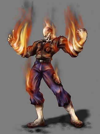
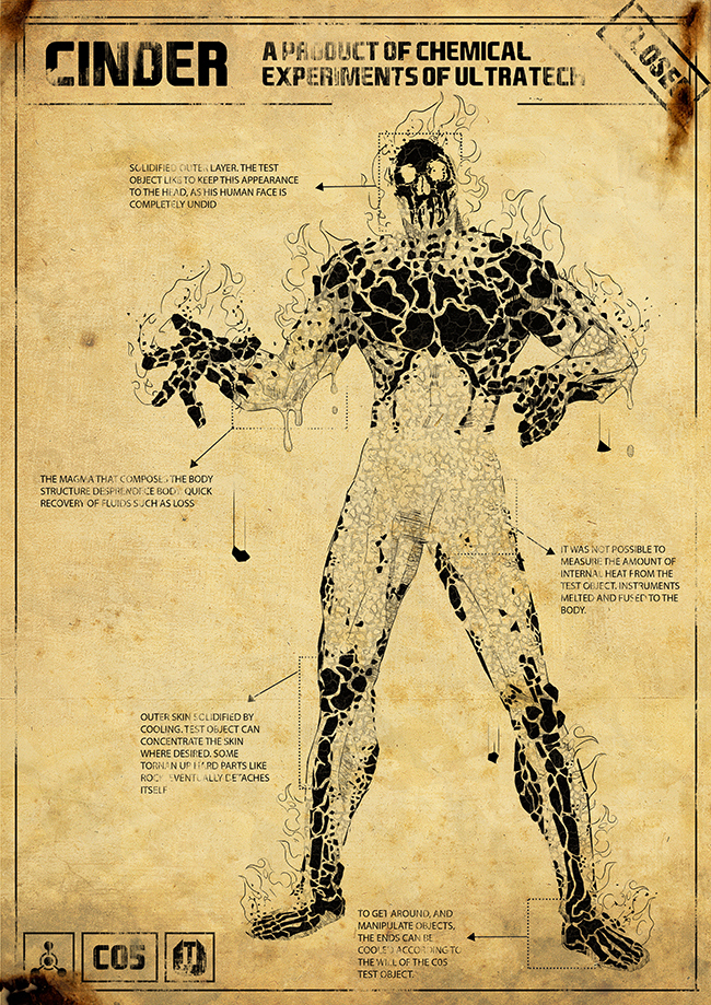
Found this on deviantart:
Still a lot better than what we got. Matter of fact, there are a lot better designs out there.
Found this on deviantart:
Still a lot better than what we got. Matter of fact, there are a lot better designs out there.
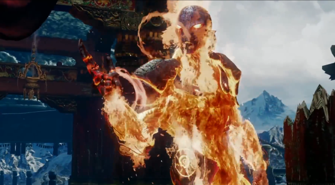
I’ve seen that 1st 1 before, and I admit, it would look kind of cool considering his fired up trait that would work well with that suggestion (he hardens into magma as he cools, and then it melts away as he heats up), but it may have made trailblazer look kind of odd too, since he’s supposed to be almost entirely of fire, not lava. Also doing something like magma would cause him to be too similar to Tremor from MKX or other rock-based characters from other fighting games (even Aganos, in a way). For this reason, I think the devs went in the right direction with him.
His armor could have been better though.
…and I won’t disagree with you there. I still can’t get over how his feet look like running shoes. ![]()
The only problem with that reasoning is that Cinder came out months before Tremor did. I don’t think MS/IG knew what Tremor was going to look like?
I think a better design would have been to make him a grappler…
Chicken fingers; twig like proportions compared to the other males characters san Omen and Kan-Ra; pointy and beaked shoes; disconnected gear; weird pose; and surfer boy personality… Cinder has so many questionable design elements that don’t seem to work well together.
I personally like Cinder’s redesign a lot. I didn’t want him to become just some lava monster because that’s SUPER generic. Even for a man on fire.
The main thing I like about Cinder’s redesign is how it was pretty much the opposite of what everyone was thinking it was going to be. Everyone, including me, thought it was going the lava man that we’ve seen multiple times and instead we get an armored man on fire wired up like a machine. I happen to like the fact that he’s wired up because it makes him look like he’s part of a certain technological company. At least more than a regular lava man would. He even has little hexagons as a symbol of said company as well which I think is a nice touch.
My question to you guys is what were you really expecting to see? What were you all expecting to come out as a redesign of literally just a man on fire? Were you all expecting the lava man instead what we have now? And do you actually prefer the lava man?
Yea I’m with you on that. I’m really happy with how he turned out (which I’m happy about cause he was my original favorite).
i am agree totally agree.. ha cool this can be, new desing, no generic lava thing the thecnology ..to keep hes energy stable woow by the way i love the exagon thing on his armor .. great desing
I had no expectations about his looks, but I didn’t expect his personality and voice to be the way they turned out in the end. Calm arrogance and a heavy voice is what I envisioned at first but I am/was surely heavily influenced by watching years of Marvel comics, movies, etc. and seeing certain stereotypes as villains ![]()
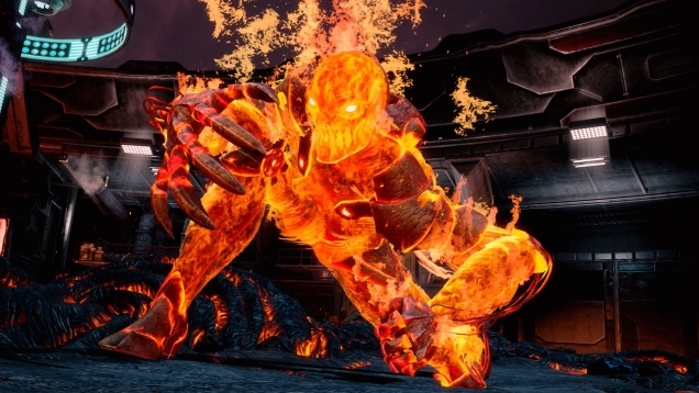
I am kinda ok with Cinder, but I feel he’s too skinny and he should be almost as big as his classic costume.
Besides, the two opposed thumbs and overall six fingered hands make no sense, look bad and have no-ingame purpose or explanation.
Move wise, he has lost his double flash kick ender, and has so many tools that since I am a mediocre player I feel like I’m never using this character’s potential up to more than 10%
I give him a 6/10 and I feel he’s the weakest redesign of all the S2 newcomers
Riptor 9/10
Maya 9/10
TJ 6.5/10
Cinder 6/10
He should have been thicker and more defined without being bulkier than, say, Jago so as to keep the relatively slender look they seemed to have been going for. Think something along the lines of Glacius…
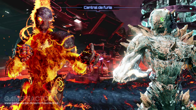
Cinder is one of the tallest characters in the game, so height is not an issue. Yet, he seems small and insubstantial next to the other male characters (excluding Kan-Ra and Omen).
Just wanted to post some clarification here and say, he only has five fingers, not six. And the in-game explanation I’m pretty sure has to do him being spliced with Glacius’ alien dna.
i dont think the cinder design is bad but when it was revealed i was disappointed because i had seen yours before and its way way better.
In my opinion, the advanced suit should be his default look. And he’s way more enjoyable visually when not using the mask.
But i would love if they gave him just a simplistic look like it was adopted in MKX. Look Scorpion and Sub-Zero. Their clothes are straight to the point. No gimmicky stuff on their look. This concept from Zeyol kinda explains what im trying to say:
Im not a big fan of his new version/look. Too gimmicky w/ alien hands and silly stuff like his shoulders and knee pads. I’ll stick w/ his retro. And the blaze of his flames looks harsh. Looks more like a chemical burning (chemical in an unfinished way) than a natural blaze. Outta of topic but i gotta say: his voice, doesn’t fit at all. He sounds dumb like all the time. Perhaps exaggerated stuff doesn’t allow us to feel the passion the character deserve.
I like the design the only thing that bugs me is the mask it looks too plain and has a stupid mouth shape ,something like this would be better but with flames coming out
I personally disagree - I like the face the way it is now.