Aesthetic changes to Killer Instinct

In this thread I’d like to discuss some of the aesthetic changes we would have liked to see in the game. It could be simply minor things or total rehauls of something, be it character appearances, stages, certain animations or moves etc.

Please note that this isn’t about the actual gameplay in any way. Only the aesthetics.

I can give you an example by stating what I would have liked to see of aesthetic changes to Orchid. And remember, this is just my opinion of what I would have liked to seen instead of what we got.

-Weapon change from Batons to Tonfas: Orchid wielding batons was a clever way to represent her KI1 weapon while staying true to her character. Honestly, her wielding those lightsabers in the first game was kinda weird, hence why I preferred her KI2 weapons - the tonfas! And I would’ve liked to see her wield those in the new KI as well.

-Shadow Flick Flack be more of a helicopter spin than a cartwheel: I would have loved if Orchid spun around like a helicopter in her Shadow version of the Flick Flack rather than just have her normal Flick Flack just do more hits. It feels like her Flick Flack in the past games covered a bit more ground while in the new game you have to be very close, so the Shadow version could have been a way to compensate for that.

-Fire Cat be a pounce instead of a sprint: In KI1 and KI2, when Orchid transformed into a Fire Cat, she pounced at the opponent in an arch instead of just running towards them, something I would have liked to see in the new game as well. Just running towards the opponent in an odd pace just doesn’t look right.

-Cat’s Call should spawn from Orchid, not from off-screen: Considering the Fire Cat is something that Orchid spawns from her own self, I’ve always found it weird that when she activates her Instinct, that the cat comes running from off-screen. It would make sense if it was some kind of pet that was waiting to be called on, but that doesn’t seem to be the case from what we know about her.

-Ichi Ni San HP should end like Spinning Swords: I would have liked to see her Ichi Ni San have included her Spinning Swords move as the 3rd hit of her Heavy Punch version, as a way to include Spinning Swords into her moveset.

-Orchid’s stage should have been a rooftop stage: Orchid had a rooftop stage in both KI1 and KI2, so it felt strange to me that she didn’t get that in the new game. Her KI1 stage was simple, yet beautiful, under the starry night sky and with the city lights coming from below and seeing the skyline in the background. I would have liked to see that stage return in spirit as Orchid’s stage. TJ kinda has a stage like that, so I like to use that stage with Orchid’s theme when playing. ^^

-Retro costume should have had knee-high boots: Okay, so, this is a topic discussed to death, but I’d still like to mention it as part of the example… I prefer Orchid’s KI2 outfit, but since the devs went with her KI1 outfit, I would have liked if they had stayed consistent then and given her the right sort of boots. She wore knee-high boots in KI1, not thigh-high boots. That was in KI2. And a retro outfit should be true to the original source material, imo. So it’s either or, and not some odd mix.
And as a side-note, her weapon still looks like some foam-toy rather than actual lightsabers. And that’s just not right.

What sort of aesthetic changes would you have liked to have seen in the game?

2 Likes

Literally, yes. I’m an Orchid main, and I 100% agree with everything lol. Like PREACH.

1 Like

Well…Shadow Jago could’ve used a skull sword instead of the serrated blade, you know, to make him look more evil as is.

That’s me though.

Although I love the firecat idea spawning from her, I kinda like the cat running from offscreen because in game should you be in a cross up or in a vulnerable area the firecat propels forward from offscreen in offense.

Should it only come from orchid, it would be a hindrance to her arsenal.

The tonfas I feel could have been represented as defined in the orchid concept photos. They clearly had intentions for the black illuminated tonfas as accessories when some unfortunate soul decided to make cattle prods.

I like the idea of a rooftop stage but I IMO saw intent in the current modern stage as a variant building evolved into destruction that mirrors her own psyche- chaos and breakage amongst an attempt to stay her ground.

Her costume was a huge miss across the board, especially the hair and accessory options.

I’d have loved to have seen a nod to her lasaken in her ultra or a potential ultimate- but judging the recent ultimate layouts rather her not even have one

Regarding Kim

I’d have loved to have seen a snowy dojo stage and also a much more thoughtful process with accessories/ retro

This version of KI has so much great yet so much potential with a new updated engine autodesk havok unreal mesh

I think that Sabrewulf should be a little more dressed up. His humanity is important to him and being the prideful socialite he was, I don’t think ends with ancient brown pants. I don’t expect anything uber fancy but if maintaining his personage is apart of his character I think it should be reflected in design.

the long haired characters received a haircut,(even Hisako :frowning:) I’d like to see either Tusk or Maya (or both) get the long locks back.
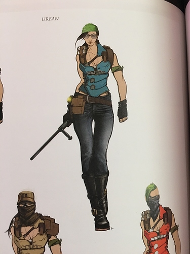
retro jago - less like a stripper
Retro wulf - that face though
Retro bot - the clipping holy crap the CLIPPING!!!
Retro orchid - more leather Kappa

Overall- can I just skip all the intro? Jeez it’s bad enough it takes a whole minute to contact the ultra tech servers

I just want new slick menus. I much prefer the feel and speed of what we had in season 1. Not a fan of the low res video that plays in the background now that seems to freeze when going between menus.

1 Like

Yep. Menu and UI would be a little bit slick. There are too many elements on screen like the smoke at the background of the character select screen its unnecessary. Shago and shin hisako shouldnt waste a single slot leaving them to kilgore and eagle. The background at the loading screen are just ugly. Remove those things for better loading times on xbox one. Organization at the select screen is a must have.

SHADOW LORDS - To make this mode and story more consistent, there should be an overhaul on mimics. Since purple effect on shadow moves represent a curse from Gargos, you should be able to get rid of it with a toggle or something after beating Gargos. A remarkable reward even when you succeed killing fully buffed Gargos. Mimics and Shadows should be shapeshifters. Replacing their current models with green or purple omen skins. So once you enter SL vs screen there woudnt be the name of the character the mimic is but just mimic or shadow. You would recognize what opponent it is by its stance. Mimics and shadows would be muted at intro or have a muffled voice. Ah, don’t forget the glowing eyes. That’s a shame because even goat simulator have this effect at the main character. See demonic and angel goat.

There are too many things on screen which makes xbox one struggle to load matches please fix it.

Shadow Lords co-op can become a great feature. I’ve heard Phil Spencer talking about games as a service on xbox so co-op on Killer Instinct are welcome. No need for season 4 i guess. The characters that didn’t make it in this game can do it in a sequel. KI just need a new graphical engine. Even with xbox one x a sequel are more than welcome. Long live KI.

An interesting point to raise is that from the 7 points suggested in the OP, points 2-5 would definitely affect gameplay as well as aesthetics, and the first point would either also affect gameplay or would involve some odd concessions such as fitting the tonfa animations to the baton animations and hitboxes, or the animation not matching the actual hitbox. The boots and the stage changes are the only ones that are actually 100% cosmetic.

1 Like

My main bone of contention with regard to aesthetics is the pre-match loading / “Fight On” Screen. Personally, I’m not a fan of the animation used for character to enter from either side, the fact that some characters seem closer to the camera or larger than they should be (or smaller), the two different KI logos with different fonts, which feels like an inconsistent design, and the background scrolling behind them, only to stop. Plus, the characters tend to blink, which just looks silly.

Personally, I’d love it if this screen had a bit more style, flash and production value. I’ve been saying it since season one, but I’d love to see something similar to the old games, where you hae a dark screen and two large boxes, one for each character, where some sort of FMV sequence plays out, showing each character looking badass.

Now, back in the day, these were usually simple things, like Cinder kicking, Wulf howling, Orchid raising her hands, Thunder throwing his Phoenix projectile, etc. Nothing too exciting, but still pretty cool, I always thought.

I’d like to see them kinda take that idea to the next level and perhaps make a brief video for each character that can play while we’re waiting for the game to load. Maybe have a camera quickly panning through a forest, through a rusted iron gate, up a castle wall and to a balcony at night, where Wulf is howling at the moon. It doesn’t have to be super long, maybe 5-7 seconds, ending with the two character facing one another, perhaps, or facing out toward the player.


Other smaller things I’d like to see:

-Cleaning up the retros for Season one characters. I know this will never happen, but it’d still be nice if these looked a good deal more like the actual characters they’re based off of, only with upgraded graphics.

-Smooth out / clean up Orchid’s face and hair, as she barely resembles the reveal trailer version of Orchid. Maybe find a way to make her face look less white than it was in the trailer, but still, more detail would be nice.

-Upgrade the textures and physics on all hair so it looks more realistic and behaves more realistically.

-Adjust lighting on Fulgore’s stage so character endings don’t look quite so bright / shiny.

-Put character art on the first loading screen after the title so we’re not just looking at a text box.

-The green and purple… It’d be nice to see these colors replaced by a more thematic palette like steel, sparks and fire or blood red and rust or gray clouds and black lining etc. Something with a bit more of a darker, post-apocalyptic / Blade Runner edge to it.

-The Ultratech theme… I’d kinda like to see this retired as well, in favor of something more universally thematic across the whole game. I’d like to see the victory font color and style used more, such as for the combo fonts. It’d be nice to see less hexagons and more of a look that might reflect a post-apocalyptic or darker setting.

A new moveset was not required with the obvious KI2 tonfa accessory concept that was clearly ignored upon her creation.

Tonfas are not always held just one way.

If you use the tonfa as a basic baton it looses it’s flair. I’d much prefer a separate move set for that.

Like both weapons and would prefer that both are present.

Either have two variations of Orchid or have someone else inherit her current weapon.

1 Like

I didn’t think “use the tonfas like batons with no change to the animations” was what the OP was going for.

What you do NOT realize the fact that it was in her concept files.

The OP isn’t the game designer, neither are we. Orchids moveset remains.

Therefore, it’s just opinion vs opinion.

Unfortunately that’d never happen

Reasonable or unreasonable…possible, impossible. It doesn’t matter we could just discuss what we’d like to see regardless.

Exactly. That’s why I posted what I did- I feel it could’ve been implemented, whether it’s possible or impossible.

I can discuss it

Or should I apply some scooby doo or obscure retro animated character to be relevant

1 Like