Yeah. There are games from the past that don’t hold up to the standards of games today, but they still look beautiful.
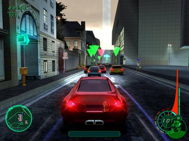
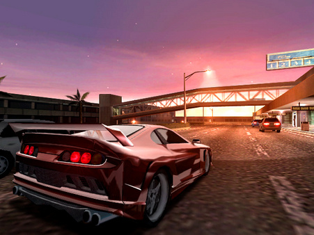
Midnight Club 2 on the XBOX is 13 years old, yet it still looks pretty good.
Yeah. There are games from the past that don’t hold up to the standards of games today, but they still look beautiful.
Midnight Club 2 on the XBOX is 13 years old, yet it still looks pretty good.
outdated graphics?
I think the graphics are amazing and fit with KI perfect.
its a rated all game, so the graphics have to be a bit cartoony. its just KI style. You like it or you don’t. Its just the way it is and i hope for future KI’s they don’t change a thing. KI does not have to copie from other games, KI has it own style of graphics and its ‘Perfect’.
We’re not talking about the style of the game.
I remember being blown away by soul calibur 4’s graphic presentation
Namco should’ve had a sequel to 5 out a Long time ago
If the character costumes detailing and facial animation matched what I see in the stages it would be unstoppable
We kinda are…because to be honest graphics and style kinda go hand-in-hand.
A good example would be Doom 64 vs Turok. Technically speaking, Turok had superior graphics for the time, yet you tell me which one has aged better:

Doom ftw @WrathOfFulgore. I love both to death and will always find time to play them but Doom aged better.
When people are talking about “graphics” it’s about the graphical capability of the game. Not the aesthetic style of the game.
It’s like this… take Guilty Gear for example. Aesthetically, the series has always been flashy anime. However, due to the graphical capabilities having been enhanced greatly in GGXrd, it looks better and more beautiful, a lot sharper etc.
Guilty Gear XX:

Guilty Gear Xrd:

Same style, better and updated graphics.
If we’re going to discuss the style of KI, then it’s more about aesthetics than how good a graphics engine is capable of making. And when people are saying the graphics are outdated, it’s not about the style of the game.
… but if that’s what they mean, then they’re using the wrong terms, at least.
If I’m going to be honest, season 1 characters (most of them at least) need the most polishing. We don’t know if they’re going to do a major polish on the game when it gets a 4K update. It would make sense but at doubtful at the same time because we thought they were going to do the same for season 3. Yea the upgraded graphics are nice but there’s a difference between graphics and polishing.
its supposed to be… she’s a ghost, ever see the movie ‘stay alive’? the countess’s face does the same thing…
ive only heard a few say that… but thats because they just came from MK more than likely… i dont want ki to look like mk… cause thats going away from what separates this game from the rest
MK is not looking that great. I mean, technologically-wise, MKX looks very good: textures, character models, backgrounds. Just the bland art style makes everything look muddy.
Like, compare on select screen: Liu Kang, Kenshi, Kung Lao - they look like they made their clothes from the same piece of curtain.
Kano stole Jax’s pants (or Jax stole Kano’s jacket)
Jacqui’s default is least creative outfit I’ve ever seen in a fighting game.
Johnny Cage’s default looks like angler, only lacks this:
KI charactars’ designs are more creative and vibrant. KI looks ■■■■ well for 2013 budget title, if devs had AAA budget at their disposal they would obliterate competition.
KI animations are not as bad as people think. They all suit characters (aside from shin hisako, this char is a total dud and it should be deleted from game)
Fulgore’s moves are efficient and menacing, what you would expect from robot killing machine. (In comparison, triborg moves like human, i personally totally not have a feeling of playing as cyborg)
Kilgore’s moves are slow and bulky and you even hear these heavy steps.
Tusk stands tall like a rock, like battleworn experienced warrior would, and you can feel weight of his giant sword when he swings it (if he was MK character, he would bounce back and forth like idiot and wave sword like dry oak branch)
Aria stands proud, looking down on opponent, her stance reflects her cold efficient, analystic personality really well. Compare her to Kotal Kahn who can’t stop moving like he has some kind of stress anxiety.
Gargos stands with his hands crossed expressing his disregard and annoyance towards those little pests who dare to stand in his way, also shows his tendency to not personally engage and curiously observing at the back, while his minions do the work. Compare it to Shinnok who has classic NRS case of bouncing rhytmically like you supposed to play their games with dancing mat or something.
Even Cinder tells a lot with his movements: he has stance of a person who does not have fighting experience or has dgaf attitude with lazy guard, short-ranged quick punches that look more like slaps and his wavy kicks as if he is about to trip (especially standing heavy kick). And STILL despite being KI’s cocky showoff he does not act in combat like total idiot.
So I don’t think KI looks that bad. It falls short in terms of facial animations but who gives a ■■■■ seriously.
I think most people know that the large majority of the characters and actions are well-animated. TJ , Maya, and Eagle make the quality a bit uneven though and there are a few other nitpicks like Kim Wu’s pretty atrocious movement in her backward Way of the Dragon.
I personally liked the new design. Each to their own though friend. ![]()