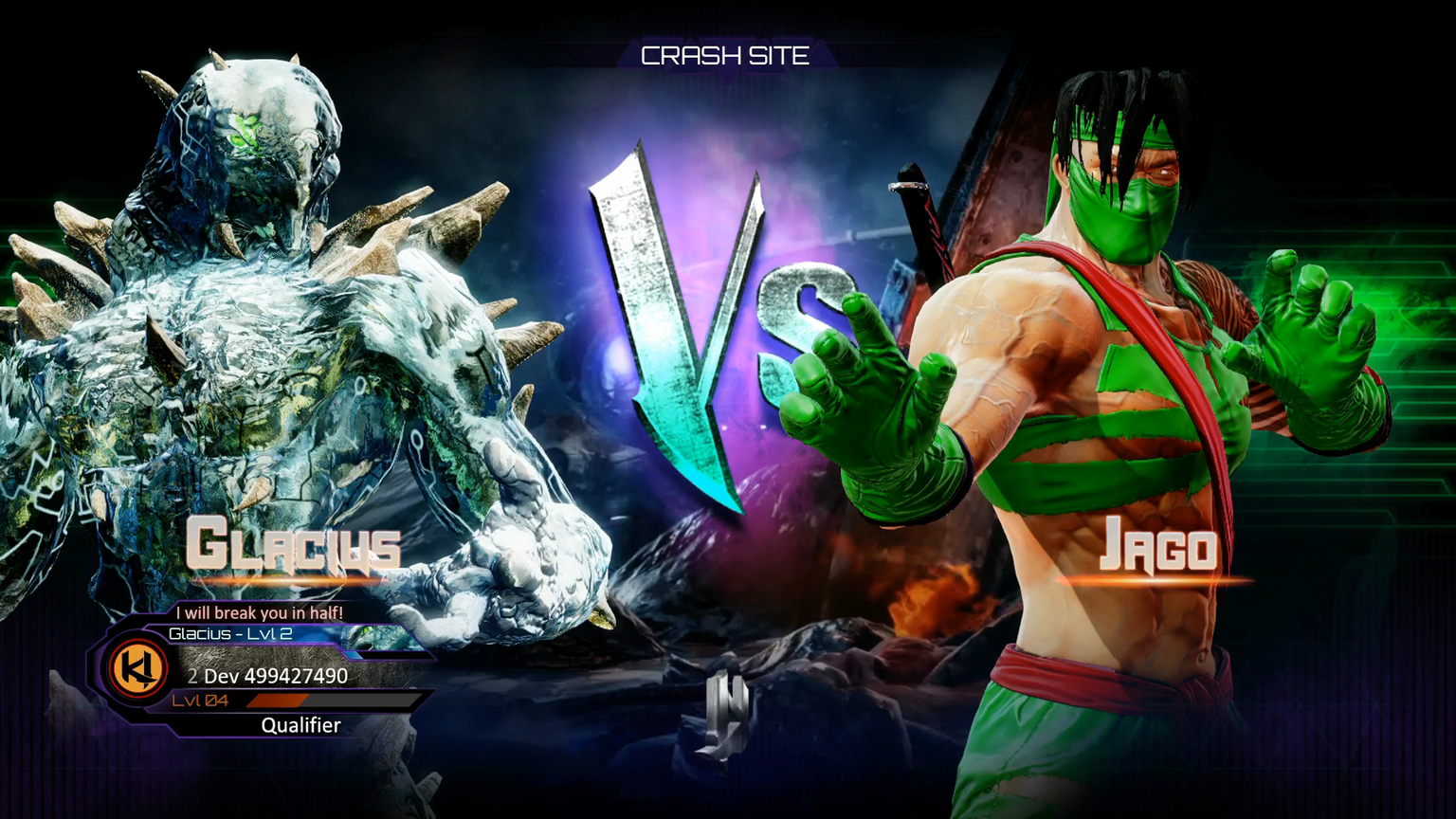
I prefer the new one. As many has complained about in the past, the UI has been very inconsistent throughout the game, but now they are making it more consistent, and I quite like the style.
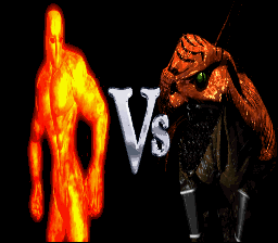
My only complaint is that “V” in vs. It really doesn’t make sense to have a capitalized “V” with a lower case “s”. Plus it just looks funky being half big and fat and half super thin and tiny.
Maybe it should look more like the season 3 logo with a solid purple in the background. The stage should look more like the season 1 or season 2 screen barely visible and the “VS” should be bigger symmetrical letters.
Given the font, I feel like it would look weird if the S was as big as the V. This way it seems to fit in more nicely under the / part of the V. Maybe I’m just imagining it weird though. Regardless, I’m a fan of the new VS screen. Looks pretty pretty I think.
It does make sense if you think about the actual word “Versus”. Though I can see where you’re coming from, I don’t have a problem with it in its current form.
I think the VS should be in front of the characters. My one little wish would be for the character animations to still be active on this screen like in SFV but it’s not a big deal.
And if they’re keeping the same poses from S1 and S2, I hope they fix character positioning. I hated how Combo, for instance, was always lower in the screen and closer to the camera, it looked messy.