Look I love KI, its Loud and Gawdy, and thats part of its charm. We get to play rediculous characters that were seemingly designed by middle school kids. Its dumb fun.
But it really could use some atmosphere, and Visually I feel the new lighting might have made some backgrounds look nicer, but all these extra reflections and lightsources are a visual mess, and Im actually starting to get a headache from the game which rarely happened in the first two seasons.
Its incredibly detailed, and runs super smooth which is great. I just dont think the lights help this game as much as it could have. Tusk for all the details he has , still looks Plasticine and flat, as if he just walked out of an old console game. you can basically see his texture map.. The fur on his gauntlets are so aliased and pixelated ,it reminds you xbox is only running on 720.. But the problem is the majority of the background visuals in game can seem so pixelated that its pretty jarring.
Somethin that you can ignore before, but not with this new lighting just showing you every texture imperfection.
Probably the reason my favorite stage , which is Thunders (aside from the amazing rain effect ) is that the background is basically one huge image that is slightly out of focus, and soft.. gives the stage a real sense of space.
Thats all these visuals need, is alittle blur.. not a lot, but just enough to make it feel as there’s a spacial distance between foreground, main stage and background objects. It might help alleviate this harsh self illumination that just makes the whole game feel like a steroid Ps1 game… That what this look reminds me of, the first tomb raider.
if you look at the profile pictures of each characters within their backgrounds,(during survival) the artist created a nice blur with edge lighting around the character to really bring it out.. Im not sure if bluring would hurt the framerate, but it would definitely make the characters stand out more, and cover up those horribly aliased alpha textures back there.
Anways love this game, its always been alittle hard on the eyes, just seems more so now.
heres what Im getting at.. different degrees of blur at different distances and some edge lighting to really separate the characters from the chaos
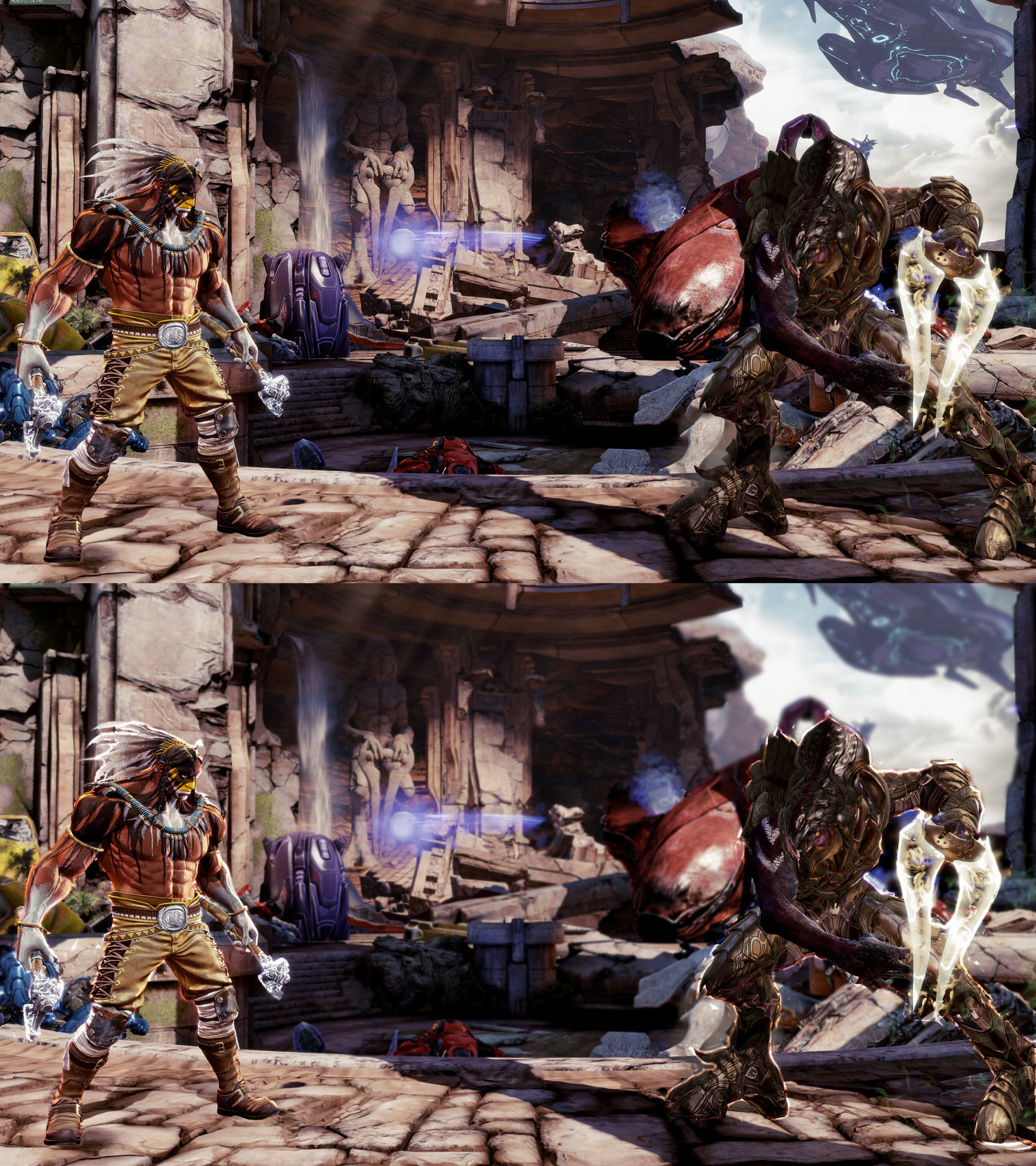
apologies for the quick and dirty mock up, but smart lasso in photoshop couldnt distinguish the characters from the backgrounds ![]()