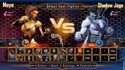
I think in time for a new character select screen. I feel this one is dull and a bit laggy. Sometimes I don’t even get to see my character because it take to long to load up. I was thinking something more along the line like this. even a background color change too
4 Likes
You’re certainly not the 1st person to suggest this. IMPO, I like the layout of the image you posted,b ut I think the hexagonal background is a bit much - there’s so much of it, it’s almost distracting… Just my 2 cents.
1 Like
Yeah the hexagonal background can be much, but just a little color I wouldn’t mind. I understand KI has a dark lore but something to brighten it up a bit i wouldn’t mind
I think season 3 will leave the ultra tech styling behind and embrace a new premise. Hopefully more smoke and lightening. But that image is a good select screen. It should rotate after selection to show the stages of the characters in the same squares
I like the layout also as a suggestion to IG I think it would be cool to choose the background layout say between season 1’s classic flames, season 2’s hexes, season 3’s smoke and background’s styled after each character.
Pretty much what I was thinking. Since we can expect season3 to be different. Maybe it’ll look closer to the classic’s? I mean aesthetic wise like colors, not function as in character select pictures being arranged a certain way.
I’m so worried about the whole thing “wowing” me cause I won’t have to be on it for long personally.
That’s what I want, a return to the old menu updated for the times. Plus I think there will be a lot more green this time, but plans may have changed.
I still think the original KI 1 and 2 and season 1 are the best and most unique character select screen you can have. However I do like this one.
Ditch the hexagonal Ultratech theme and do a smokey purple/green season 3 theme and I’d totally dig the layout.
2 Likes
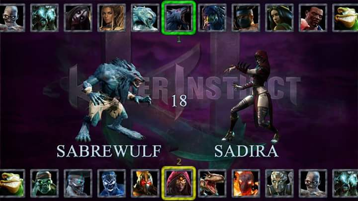
see i would also like a set up like that but since not all the characters are not on screen it might be a probably remember there is also going to be 8 more people coming so scrolling like that to try to find your person would a be a tad bit annoying
I hope they do some cool stuff with it, but mostly just fix it to respond better. That’s probably the number one issue.
Yeah that what i want too for season 3, because sometimes with the delay i pick the wrong character
IMO, that’s way too retro. Having the same portraits on the top and bottom is weird, using the small in-game character poses are uninspired, and everything else looks really bare, ![]()
I agree with OP that the selection screen in the first post could work with a less distracting background. Not that the layout is ground breaking, but it doesn’t have to be. It looks like most other fighting game selection screens, but they’re usually designed like that because it makes sense and is easy to navigate.
1 Like