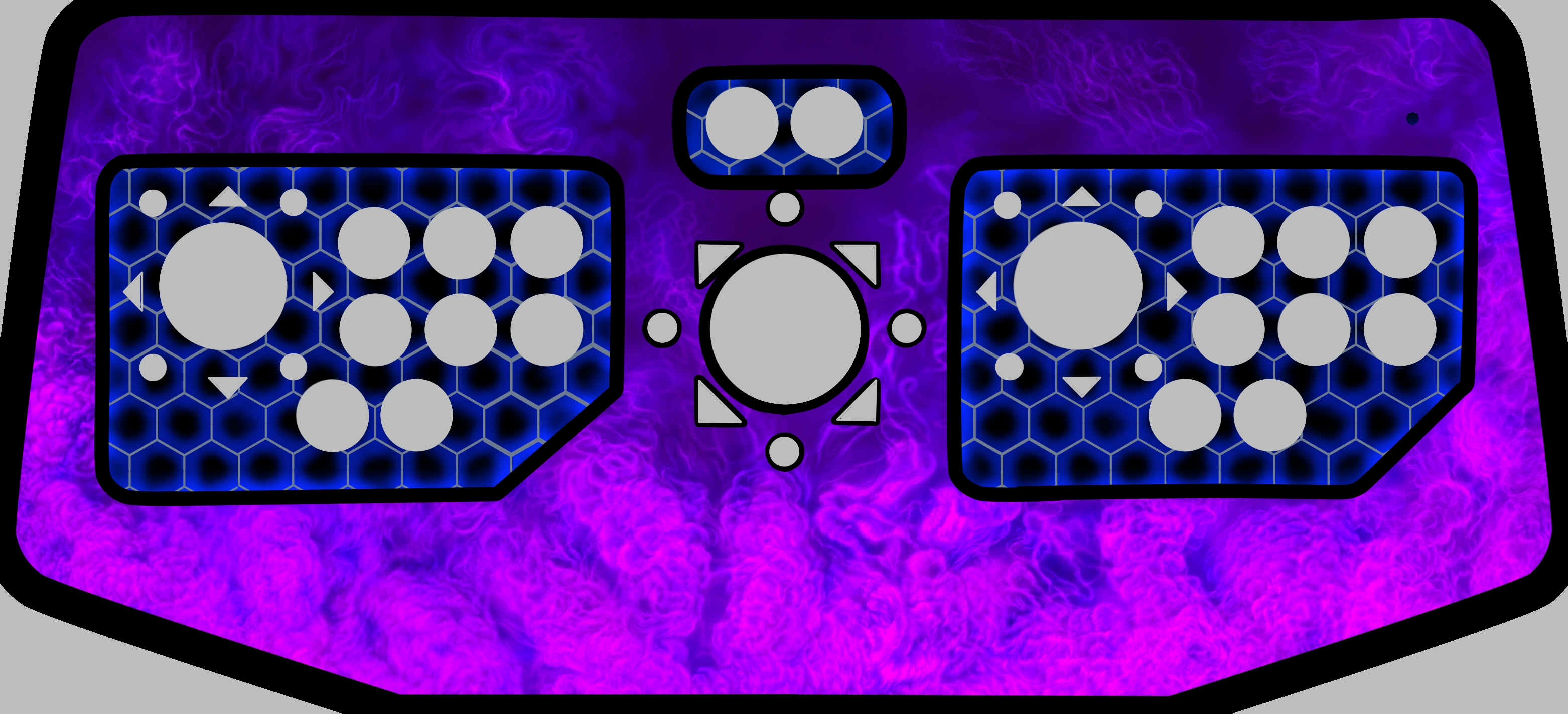
Looking good. I would like it tweaked a bit if you don’t mind. On the blue hexagons, I would like the gray parts of it darker, pretty much black. This is what I was going for on it, particularly the bottom left quadrant of this image:
No problem. I’ll make the adjustment.
1 Like
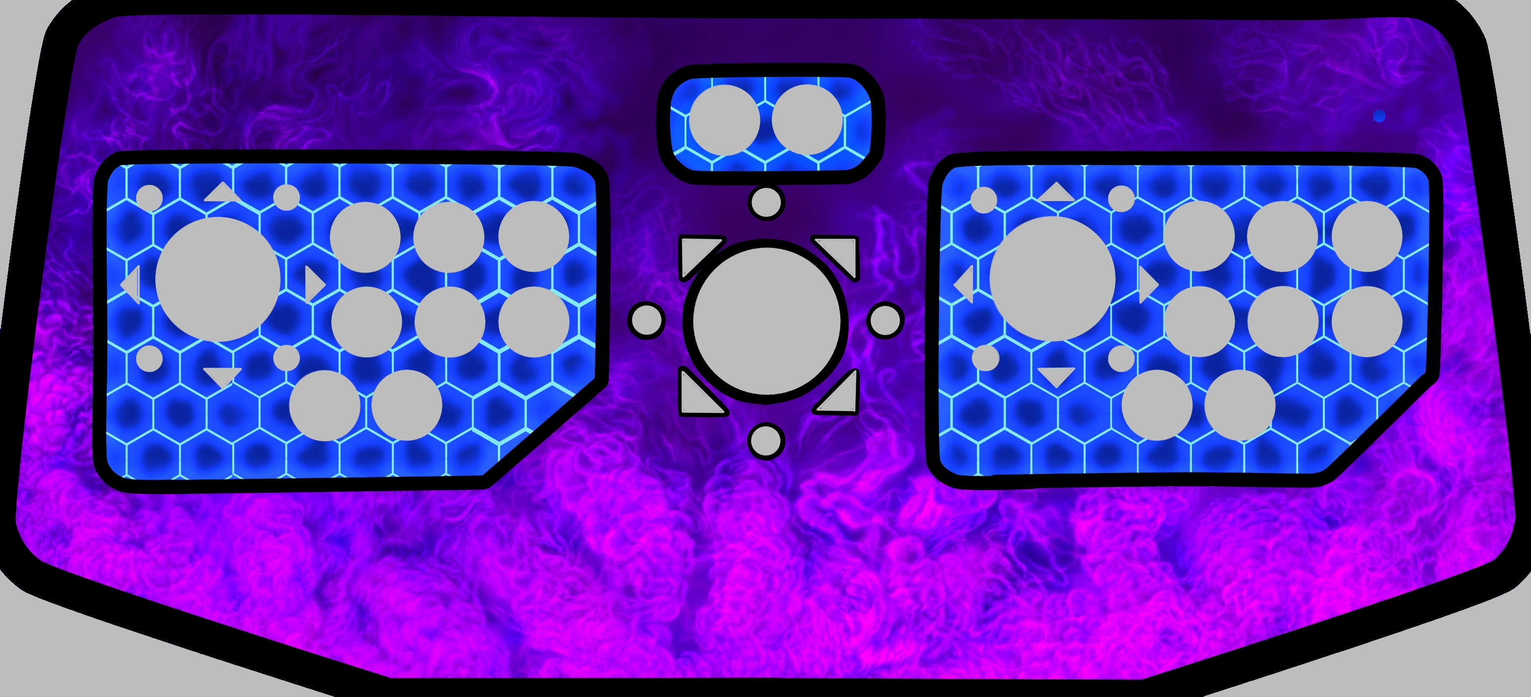
Ooooh…they’re both good.
Dangit, now I don’t know which one I like more.
Awesome job!! They’re amazing! Thanks a lot!
No probs. If you can find a decent res logo, that should finish it off nicely.
1 Like