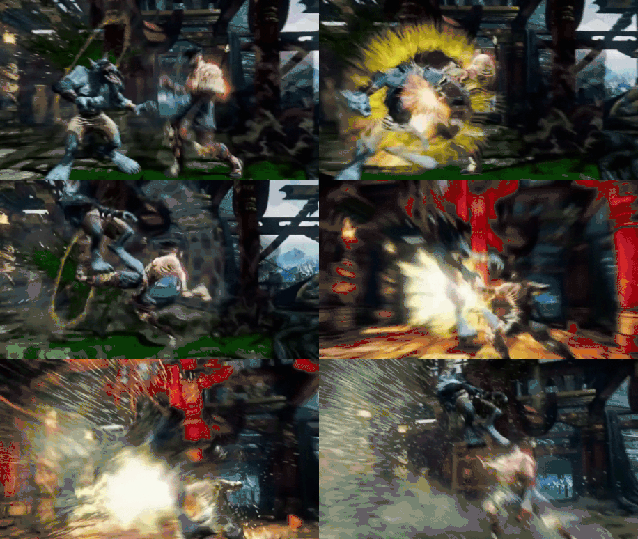
so like the guy said above: totally redone or removed.?
Of course, because of the 2d plane, when rotated in 3d, can show gaps in animation or all sorts of things that give the illusion that you are connecting blows with your opponent.
But the cameras can be reworked a bit or they make it so Tusk’s foot can connect, and not detract from gameplay.
Nothing is really set in stone. Not that we know of anyways. For all we know, they could be working on it now. Like they did with Kim’s Face and such.
Check out my suggestion for it here: Another Potential Application For Lvl 4 Enders
It basically addresses your issue, in such a way that it does not affect gameplay at all.
Agree, the vfx is just not good. I think that using just a sound effect would be great. The screen turning black and the camera going to places where it should not be is definitely not a good a idea.
I think this is a reasonable suggestion.
This is one of the better looking ones and it still looks super janky. The transition from the blacked out background to the normal background is so abrupt and ugly.
Not all of them are like that from the ones we have seen.
I’ve freaked out about enough things in KIs development to know that there’s nothing to worry about. IG is listening. I’ll save complaints until after release. And even then I might wait for a patch or two before I start getting anxious.
I’ve kind of dodged how I truly feel about these but now since the legendary Sajam as come out of hiding to voice his thoughts from a commentators perspective, I thought I might as well too.
First off, I got to see these a little bit before everyone else did and at first I was like holy crap, that was cool; however as time went on and the more I saw them happening they got worse and worse looking and eventually I didn’t like them at all. I have several different problems with them but overall the biggest issue for me and others is how janky they look especially using the same animation for all enders. From a spectators/competitors perspective such as myself I think having something like this in it’s current iteration is not a good look for the game especially during a time when a bunch of new players are going to be trying out KI soon in S3 launch.
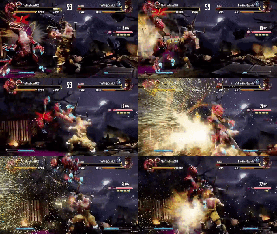
While I can appreciate MS/IG for wanting to make level 4 enders feel awesome and special, especially coming off of S1 and S2 which was mostly 1-chance into setup, I feel they took the wrong approach with these or rather implemented the idea poorly. There was another great suggestion in another thread which pointed out a cool effect added into the launch trailer of Season 1 which gave level 4 enders this slow-motion pulse effect.

While still edited in, this still added a subtle but powerful effect to the ender. The camera slowly pans to the side and quickly back in again and to the action; kind of also brings some of that nostalgia back from the old KI2 game where characters would slowly fall back to the ground after an ultra.
Here is the same ender in the current version of the game.

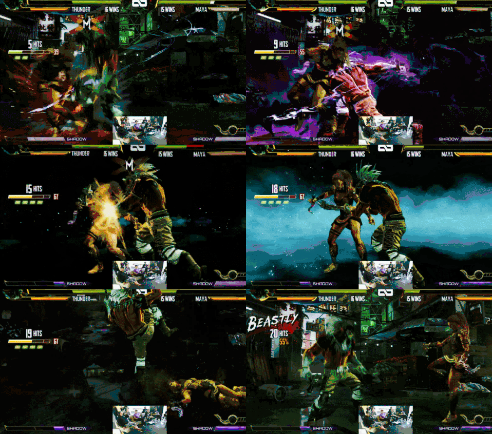
The whole fading to black thing and having an awkward looking teal stripe in the middle of everything is just weird and bad looking overall. They should definitely lean more towards the original animation in the .GIF I posted above. The one thing I can’t stress enough though is that each ender type needs to have a different animation. I’m not saying make a new animation for every character in the game , but just so that a level 4 battery ender looks different than a level 4 wall bounce ender, or damage ender etc. Just another flaw of the current version they showed on Tuesday which had every ender in the game using the same animation just felt bad.
I’m just one person and I don’t speak for everyone but below I’ve posted some thoughts from other players.
(#BuffKimWu)
I agree as well - it’s annoying.
yup, for the first time since 2013 the combo system has been tweaked. The combo system is KI’s life blood and if its gonna be tweaked it better be done right. This is just way too much. You can add flip outs and what not, but the core remains the same. Its just out of place for this game and just looks cheap. Good intentions from IG but just lack of foresight I think.
Dang, that SE1 ender shakes the whole screen. hits hella hard!
Be careful, that’s not a true S1 Ender. It’s taken directly from the KI Season 1 Launch trailer, which was enhanced for the trailer.
0:25 is where it is.
I think that was for the trailer only. I wish they hit that hard though lol.
whew, i was silently thinking, "how is this better the whole screen shakes. lol
thank you for making my brain a little bit brighter 
LOL Yeah. S1 enders are the same as S2 enders. Why LCD put that one up, I have no idea… 
People are going to get confused if they see that one.
Please Remove
The BEEHHH has spoken.
I still don’t think this one is too bad ( not talking about quality lol) when Thunder hits it hurts, love that stomp at the end.

So, the one hit thats not in the new effect? Lol


