I say Sadira’s.  Spinal’s is awesome. Love the backlighting on Maya’s and Aganos’. Don’t see a huge change to Jago’s or Aria’s yet. Cinder’s looked pretty similar to before too.
Just out of curiosity could the forum members post pics of all the shown relit stages on this thread.
2 Likes
In my opinion, it’s Aganos, Maya’s, Sadira’s, Orchid’s, and Fulgore’s
Honorable mention to Thunder’s, Spinal’s, Kan-ra’s, Hisako’s and Cinder’s.
Cinder and Fulgore, they were barely playable on too much red.
1 Like
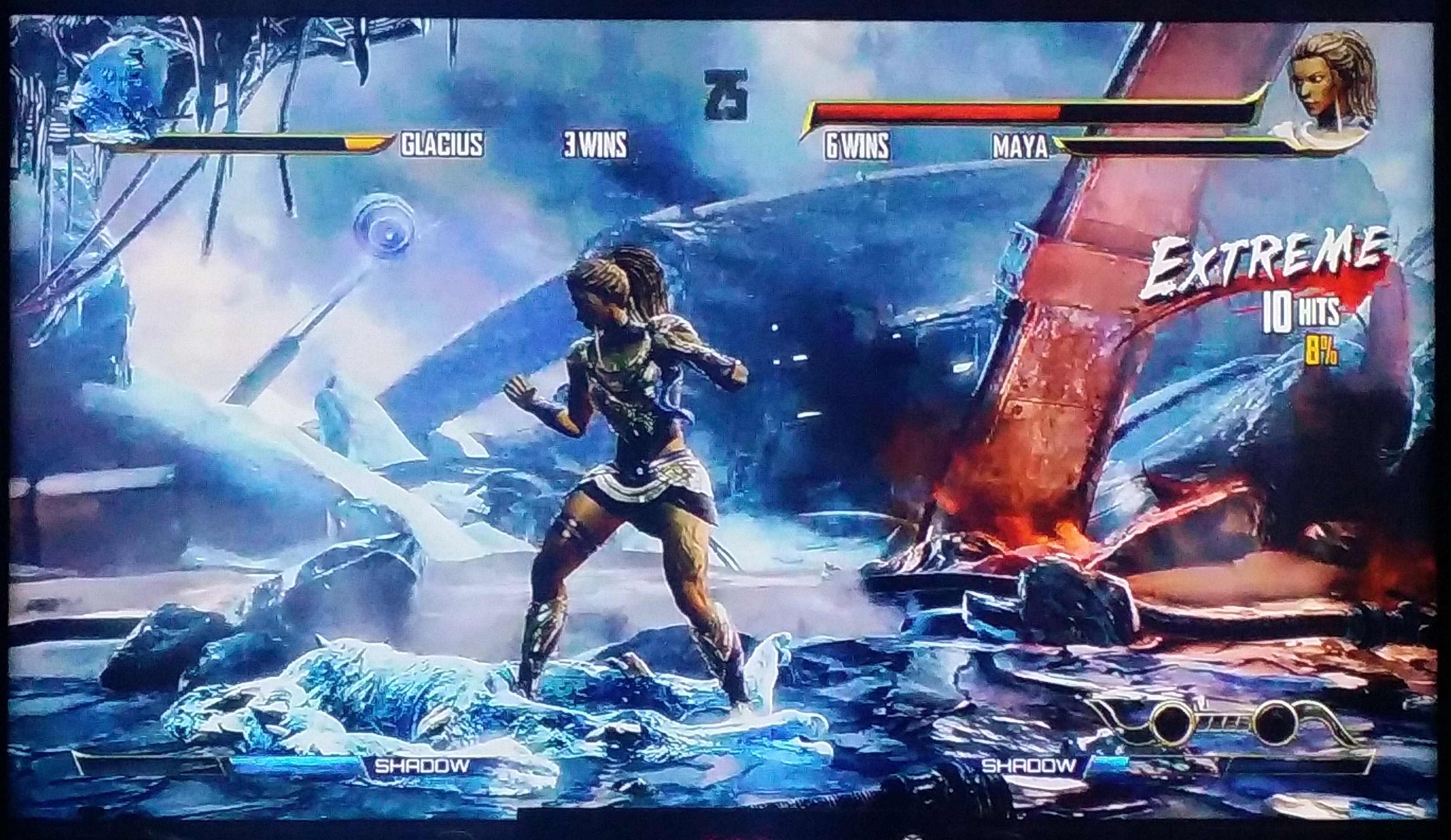
Spinal’s, Glacius’s and Sabrewulf’s looked the best to me so far. I haven’t seen Aria’s, Fulgore’s, or Orchid’s yet. Got a glimpse of Thunder’s yesterday too which also looked nice!
The majestic waters on Aganos stage is such a beauty, ill just be going there the stand around with my Jago… also as the extra details that are revealed in Sabrewulf, Kan-Ra & Sadira’s stages are quiet awesome
Orchid’s, Sadira’s and Glacius’
Maybe I missed an update on Spinal’s, but I am not as pleased as everyone seems to be. The complete removal of any sign of green kinda takes it away the creepy, spectral atmosphere that is supposed to acompany the cursed skeleton the stage belongs to.
I actually love how spinals map looks like now. The only change I would make to it would be to make it glow greenish and spectral as the round progresses since they are waking up all the ghosts there.
Sadira’s for me. Never liked the original stage, but with the new lighting it looks really good.
Aria’s also looks good, particularly in the opening phases before the windows open up.
Spinal’s looks pretty neat.

I’m glad Fulgore’s looks good again.
Thunder and Maya both seem to have just been slightly improved, since they looked great to begin with, but they’re still neat.
Anyone got screen caps from Cinder’s stage? I missed it if they played it.
Don’t have a screen cap, but it actually looked much the same from what I could tell.
I totally agree about Spinal’s being a step back in terms of color. It’s the first thing I noticed. Really miss the green hues.
Similarly, I don’t like Glacius’ stage either nearly as much now. I loved how the whole stage was a similar hue before. It looked freezing and overwhelming with a general color throughout. The stark contrast in colors of the background object clashes too much. It takes away from the cohesive color scheme of the stage. I’m hoping they can dial back the color of the wreckage a bit so it’s less conspicuous.
Both Spinal’s and Glacius’ stages were my favorite in any game in ages, with the feel the originals presented. I’m bummed they changed up the colors. It reminds me of Darkstakers Revenge (Nightwarriors) where they changed all the stage colors from the original and many were a step back. Changing Anakaris’ beautiful yellow/gold tomb stage to blue/green still bugs me every time I see it.
Also, disappointed in Thunders, as the colors seem very washed out now. I loved the color of the sky before, but it just looks unsaturated and grey everywhere now
I feel like overall in trying to light up different parts of the stages on several of these, they made such contrast in color between items and parts so that it affected the overall aesthetic. Almost like they made some elements too distinct.
Hope that made sense.
2 Likes
Spinal, then Maya.
Aganos still has that thing in the right side where the characters seem like they’re floating and their feet are not on the ground. Fulgore is still unreadable and affects gameplay/visibility.
Thunder looks MUCH worse. WAY too bright.
Shadow Jago look much worse, lost the cold, dark eerie feeling.
In fact, outside of Spinal, every stage looks way too bright and lively now.
A LOT of them look super garish now (every stage has some orange or purple FOR NO REASON). It’s like the art team has never studied color theory.