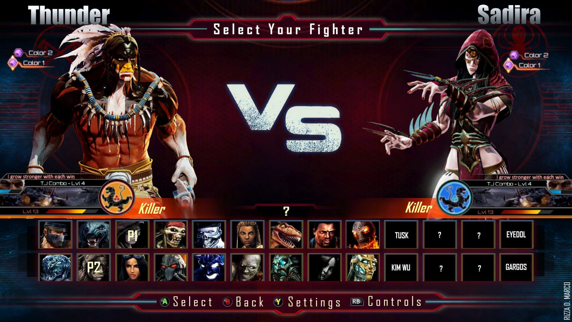
Very nice. Visually pleasing, well organized, efficient on space.
It even looks somewhat easy to change if Season 3 ends up with a 9th character (i.e.3 rows of 9 instead of 2 rows of 13).
I think your design has potential,especially with an 8 character S3.
Within the construct of season 2’s art style, I think it’s great. It’s functional, yet easy on the eyes. I’d personally like to see a little more flash in the background. Perhaps something darker, with lightning, maybe a neon “V” instead of VS… But just looking at the picture itself, I think that what you did here was awesome and if that’s how it wound up looking in season 3, I’d be down with that, no question.
my idea is only representative, the fonts should be improved, behind the fighters should be their symbols as now, and the graphic effects should be improved.