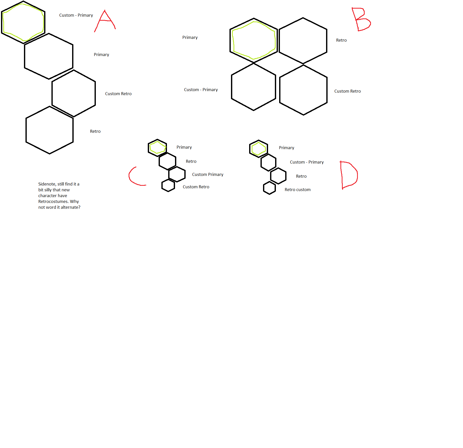
When you select a character in a fightinggame for the first time, you usually get the default version of it. The default outfit & the default color. This is the case for KI somewhat as well…
BUT! When you have created custom versions for both the primary & the retrooutfits the cursor when you choose the character start on the customversion of the primary instead of the default costume.
I play vs AI to level up quicker & when I do I mostly select the default outfit without accessories - & while I play I change characters quite often so moving the cursor one step down everytime to get the default outfit is a minimal timewaster. - The select screen isn’t 100% smooth yet either.
And let’s say I invite a friend over. I made customslots for every character. He goes to say… Orchid. He could select the default costume right away because most fightinggames you just click on the portrait and everything is ready to go. Instead he end up choosing Orchid with the punkoutfit as that was my first customslot, and that looks quite horrid compared to the original outfit.
‘A’ is how the game is now. I would suggest changing the UI to my ‘B’ option. But if moving around the icons is out of the question then at least is it possible to change them around like ‘D’ or ‘C’? The green line is where the cursor start at.
What is your opinion on this? Would B be better? Fine as it is?
It would also make it possible to end up on the default character by spamming the A-button to start the match without ending up on a custom creation.
I am aware of this being a very minor thing but in my opinion would make the game make a little more sense.
1 Like
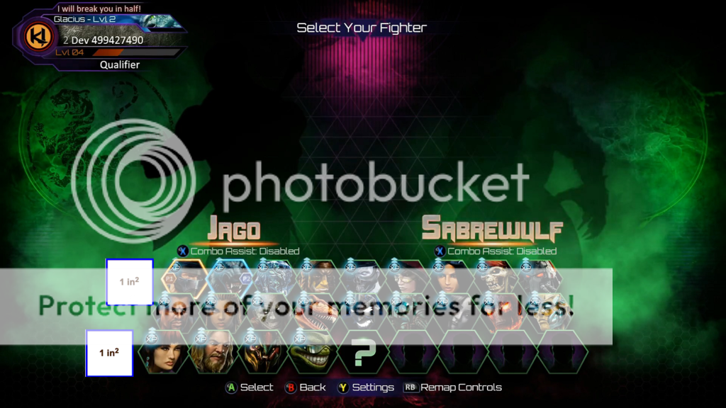
My only problem with the character select screen is that the hexagons are not even. I think they should be the same size.
Haven’t noticed that yet(not played very much of S3 yet) but it sounds like it would be better off with all of them the same size.
1 Like
My suggestion for the character select screen is that Hisako needs to be flipped cause she’s facing the wrong way
Yeah the slots for the season 1 characters are really small, s2’s character slots are medium and s3’s character slots are really big.
Ah you mean those hexagons. I can see your point but in a way it fits. It both looks like a seatingrow before say a cinema or stadium & it puts season 3 up front, and season 1 back as it is the oldest. But when the game is done I would also want them all to be treated equally to have the same size for them all 
Yeah I agree and it has been mentioned before. A pictureswitch shouldn’t be too difficult to pull off.
But Rukari did mention that this UI is NOT the final version. He especially mentioned the double xp icons. Why would we ultra owners want that big 2xp logo visible for all time? ^^
1 Like
I made a thread about it a while ago, but everyone says she’s looking to the left and honestly I do not see it, I see her facing to the right towards Cinder.
Maybe add a quickselect to your main like they do in SF5?
Another suggestion I have for the character select screen is to improve a few characters walk-up animations, namely Spinal, Aganos, and ARIA.
The issue I have with Spinal and Aganos’ walk-up animations is that they’re generic forward hops and 2 other characters also do the same thing but suit them better: Wulf and Maya.
I think Spinal should do something along the lines of what he used to do and still does in the customization menu where his bones come together to form his body.
Aganos I’m not too sure what I’d like to see him do, maybe beat his chest like his taunt as he walks forward.
As for ARIA, hers isn’t bad, but I’d like to see her fly forward slower maybe to make her look more graceful.
1 Like
I think what’s going on is that they’re overlapping each other.
Yeah most likely - overshadowing makes things in the back row seem a little smaller, despite being the same size.
One more thing I’d like to see change on the character select screen is the green smoke, it should be behind the characters so that we can see the color we’re picking better.
1 Like