I do not know what you combined with Sabrewulf stage, but lost all its charm… before it was colored and dark, now is faded and bleached. not have more personality.
I do not understand why you need to change what works well.
2 Likes
Ikr it doesn’t feel like where Sabrewulf would be living in. He wouldn’t be in something that’s bright and bleached for a feral wolf.
1 Like
Ah, now it makes sense. I thought something looked really off about Sabrewulf’s Stage. Dude, at first I thought my TV settings got messed up or something,Ha! Then I just figured maybe I forgot how it looked after not having played KI for awhile.
They didn’t change it intentionally, it’s a bug that they’ve been trying to fix for the last few patches.
3 Likes
BEFORE ALL DAY LONG!
the stage looks crap now… its meant to be dark and oppressive atm it just washed out.
It’s definitely too bright, but if it’s a bug that they’re actively trying to fix, I’m sure we can cut them a little slack here.
That said, a small part of me does kinda like how the sky looks with the brightness up a bit. You can really see the fog and what not. Man… I’d love it if this stage had a knock off…
1 Like
Actually, the problem they are aware of and trying to fix, is when the stage appears super foggy/hazy - which is much much worse than any of the screenshots above. See below:

This is the issue we’ve been pointing out for the last couple patches. The OP’s ‘after’ screenshot up top is accurate. I think it actually looks 10x better than the old one.
In the first screenshot from OP, yeah it’s darker, but lets get passed the “KI needs to be darker” thing, and realize how much more detail you notice with a semi-brighter stage. When I look at the first screenshot (and during gameplay of S1), I mainly see the Incinerator, the churnning wheel thing, and the window outside. With the lighting now (in the ‘after’ shot), I’m seeing evvvvverything. It seems so much fuller and fleshed out. Personally, it made me appreciate a lot of the details that went into the stage, that I never noticed with the darker lighting.
With the changes to the lighting, everything on the ceiling looks much more defined, the literature on the ground is much more noticeable, as is the rest of the machinery in the background. I think the change they made is great . It’s one thing I noticed about IG when they took over, is I very much like what they do with stage lighting (with the exception to Fulgore’s stage, ahem…). Hisako’s Stage, Riptor’s, Kan-Ra’s, Aria’s, are all incredible and seem to have more thought put into the lighting itself, than any stages from S1. And I’m not just talking about how the background looks, but how the lighting actually affects the character models. For example, the lighting on Maya’s stage actually feels like the character are out in the sun, where the brights are slightly blown out. While on Hisako’s stage, all particle FX seem to ‘glow’, which looks stunning.
Call me crazy, but I’d encourage IG to revisit some of the S1 stages and see what they can do to enhance the lighting and colors a little (Thunder’s, Sadira’s).
1 Like
It is a bug that is known by the devs… no point in making a fuss about it when it isn’t intentional.
1 Like
Nah, it’s different than what the developers are trying to fix.
There have been 3 variations of the lighting (video examples of each):
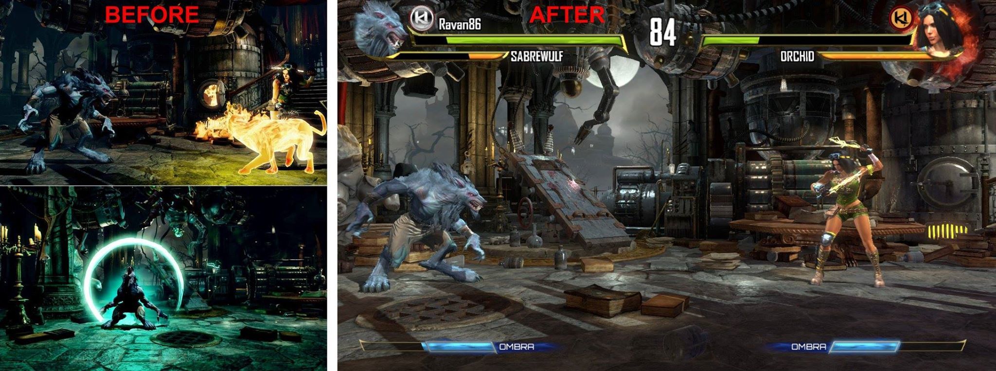
1.) S1 darker stage lighting (the ‘before’ as seen in the original post) ex: youtu.be/594cemT0xpo
2.) A brighter version (the ‘after’ as seen in the original post) ex: https://youtu.be/nZh6o1r26PU
3.) The occasional washed out version which the devs are looking into. ex: youtu.be/tV69kRPWsFA?t=6m58s
OP is referring to #1 and #2, not the glitch (#3).
I’m going to have to disagree, the artist in me finds the “Before” version way more aesthetically pleasing. Yes, you can see more detail when the stage lighting is brighter, but I have two problems with that: 1) The stage becomes cluttered and the foreground and background all begins to melt together, and 2) The lack of one or two predominant color hues to tie everything together makes it look much less dramatic and atmospheric.
The darker light fits the character’s dark background and the blue and green hues color everything fit his brooding/reclusive demeanor, as well as the supernatural aspects of the character. It looks creepier, has a stronger sense of atmosphere (blues and greens are cool colors and generally give a cold vibe) and, like you said, allows your eyes to drift naturally between main points of focus in the room–the lab table, the moon, the incinerator–like a moving composition. It also makes the characters and action “pop” a little bit more because background details are obscured by shadow and fog. This is how things function in the real world–the further away something is, the hazier it is, the harder time you have seeing all the detail to it.
Just my two cents. In the end it’s something people are going to agree to disagree on. I was under the impression that the lighting glitch was what made everything look washed out and that it would be restored to something closer to what was present in S1, and am disappointed that’s apparently not the case. But I’ll live. Time to just pick other stages, I suppose!
This is a known issue - not intentional.
2 Likes
Objective of the topic explained. Topic concluded.
Wow i wish there was a night version of Rebel Outpost!
1 Like
Adam, please just go back to S1 lighting. Every time there’s a patch the lighting gets worse, and it was fine in S1. Please, just stop messing with it and return it to its original state
1 Like
Well, as you can see by the patch notes, this is fixed.
@Frodo54 Your “messing with it” comment implies there’s some intentional and underhanded action on our part to change things like this. It’s not the case. Bugs happen. Many things are being worked on behind the scenes as we get closer to S3, which can have unintentional changes that we don’t catch every time.
We good now? Cool.
3 Likes