Hey KI fans it’s good to to be posing again! I Had trouble posting as I couldn’t see what I was typing as the on screen keyboard was in the way but I figured out how to change it to float. .
OK that’s sorted on with the topic!
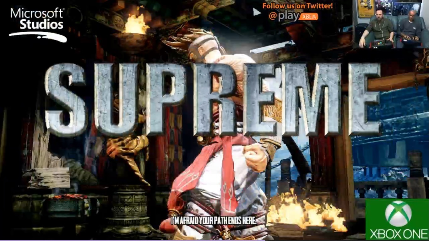
I never understood why some letters were made long in ready awesome supreme etc. They started off with a clean look then made some letters long which I always thought was odd. For me these always looked out of place. Eventually I had to get used to them.
I dont know which direction IG are going with the look of KIs UI and hud but would like the characters name font to be used to replace the current font of the metal call outs and combo font but keeping the shiny metal look.