I agree that the UI needs to be improved.
I actually disagree on both counts with what was better (per your post), but I respect your opinion none the less. 
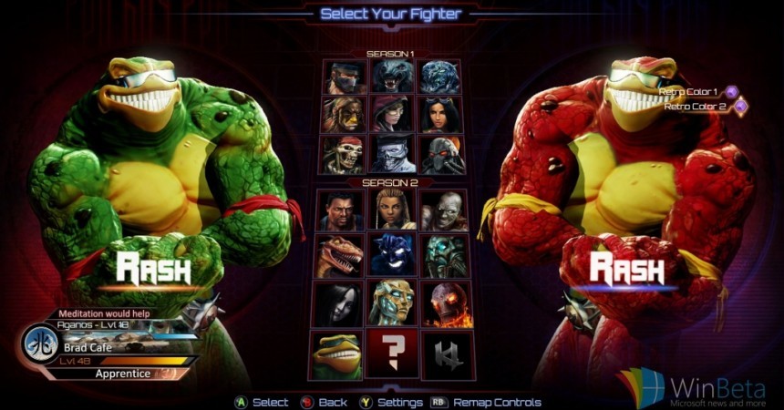
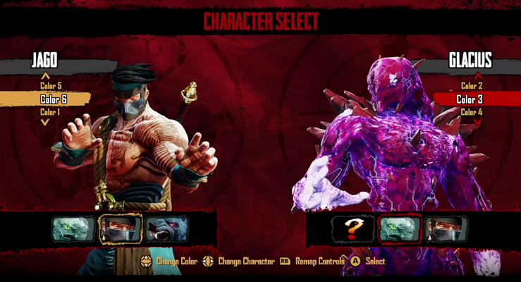
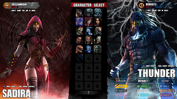
For the select screen, I think that Season 2’s sort of angled grids, where the tops were kinda tilted back, cut off by seasons, looks kinda wonky and could use a more sleek and streamlined, perhaps flashier, stylized design. I also find it odd that some of the 3D models appear closer to the screen (TJ) than others (Aria).
Season 1’s might be a bit more minimalist and rather unfinished looking, with some Street Fighter-esque paint splash design (which I’m not a fan of at all), but it has a more vibrant and fluid design. At least to me.
Either way, I still think that the select screen needs to be improved upon. More going on in the background, such as rolling clouds, lightning strikes etc, quicker load times for the models, better cursor movement… Just more flash and bombast overall that makes it feel like you’re playing KI. I’d say MKX has the character animation part right. Something like that would be cool as well. The more signature character moments, the better, as far as I’m concerned.
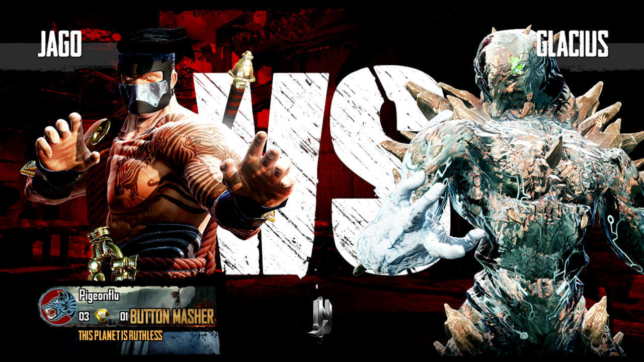
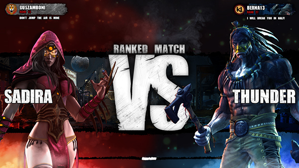
As for the versus screen, I didn’t like season 1. I wasn’t a big fan of the screen turning black and white, the gigantic, intrusive VS symbol in between the characters, and all the wasted space.
Granted, there’ still wasted space in the Season 2 design. I also don’t feel like I need to see my profile icon/info on the versus screen. To me, this should be the pre-fight hype moment.
I’m not normally one of those “it has to be like old KI” people, but I’d like to see them go back to the original arcade KI for inspiration on the versus screen. No more having the characters appear on screen, freeze immediately, and then have me stare at a near silent screen for the 5-10 seconds it takes to load the match.
Have a sort of FMV style intro of the character. Like a camera starting just above a missile and following as it’s shot from a helicopter in to Orchid’s stage. Just before it hits, have a highly detailed Orchid dive out of the way and draw her tonfas, with the camera panning from them, up to her face with an angry, resolute expression on it.
You have that on one side, and then on the other, you have a camera quickly panning through a dark forest, through a metal fence, up to a mansion and up to it’s balcony, where a highly detailed Sabrewulf is howling at the moon as the camera pans up to his face and his shining eyes.
As that’s happening, A glowing neon “V” appears between the two FMV sequences and sprays light above, below and around each sequence as the announcer says “Fight on”
To me, that gets me way more hyped than staring at frozen images of the characters in-game models. Like I said, use this loading time to hype me up for the match. Don’t just reuse the character’s moving in to the camera animation that I just saw on the select screen.