Some suggestion for UI fix

So here was the day the new UI came all over us

But some old odd things still in place, and why no body fix it?

Sneak peak of the color and the accessories would make it so MUCH better for visual reading, and it’s already done, just code and place it.

11 Likes

That’s a nice suggestion. I actually think this is constructive.

3 Likes

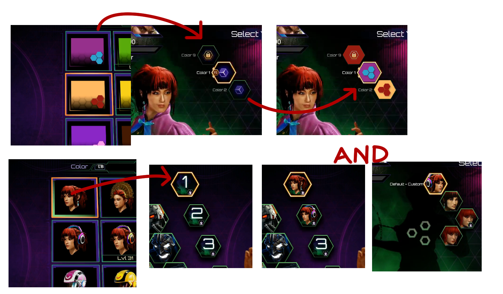
Those are great suggestions that seem feasible and would make character selection look a lot better while providing better info. I doubt it’ll make it for launch but hopefully the devs take this suggestion to heart and look to implement it :slightly_smiling:

1 Like

I was actually commenting about the colored hexagons in another thread, it’s a great idea. I don’t have any idea how difficult it would be to implement though…

tis is a good suggestion.